Walgreens COVID-19 Testing
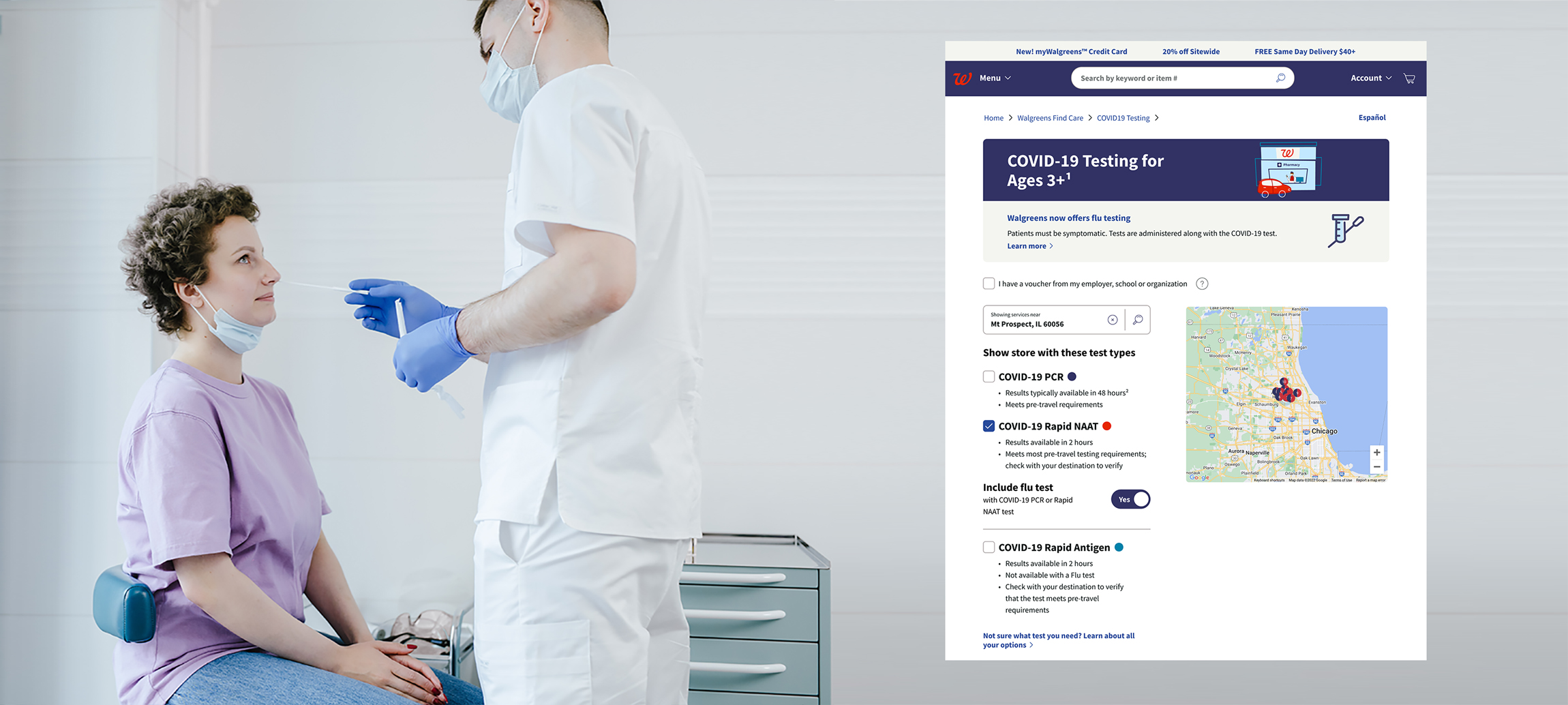
Project Context
ROLE
TIME
TEAMMATE
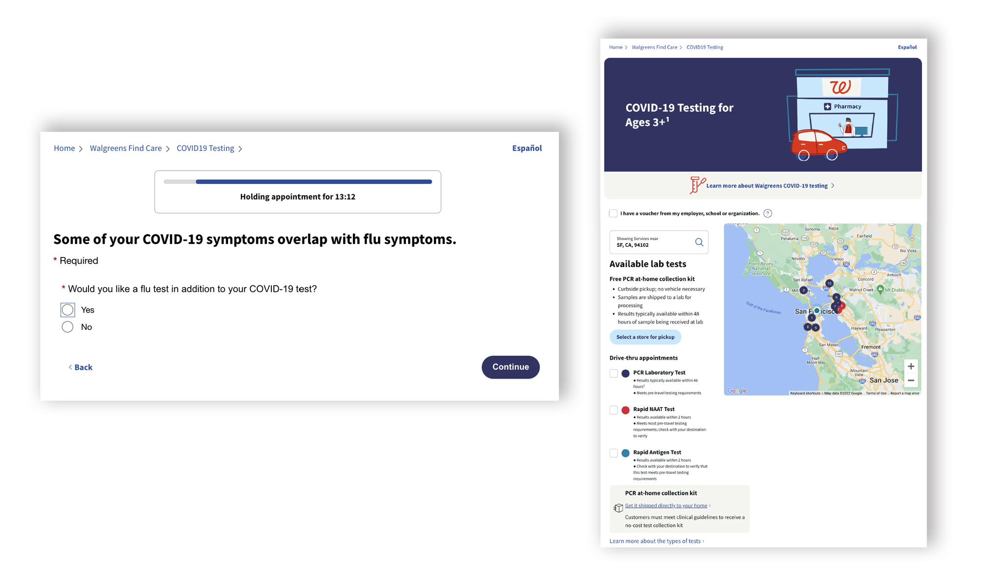
Challenge

Flu shot upselling involves many constraints

Stakeholders from different teams with different needs
Problem Statement

Analysis
Key Requirements / Constraints for designing new features
Medical
- COVID-19 Rapid Antigen can’t test together with flu test
- Different test types have different times for results
Insurance
- Flu test can only be selected with COVID-19 test
- Voucher patients are not available for flu test
- Uninsured patients are not eligible for a COVID-19 + flu PCR test
Operation
- Not every store has availability for flu test and and certain covid test type
Business
- Increase the visibility of the COVID + flu test to encourage more people to notice it and book appointments
- Tight deadline
Problems from previous research / insights
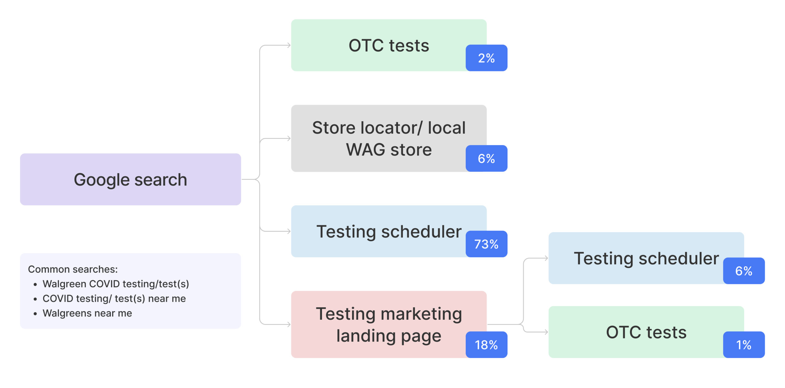
Most of Users (73%) missed the marketing page and land on the testing scheduler page
Because user are doing Google search keyword instead of going to Walgreens page so users didn’t see important information, such as the test options for different purposes, potential cost, test types, etc…
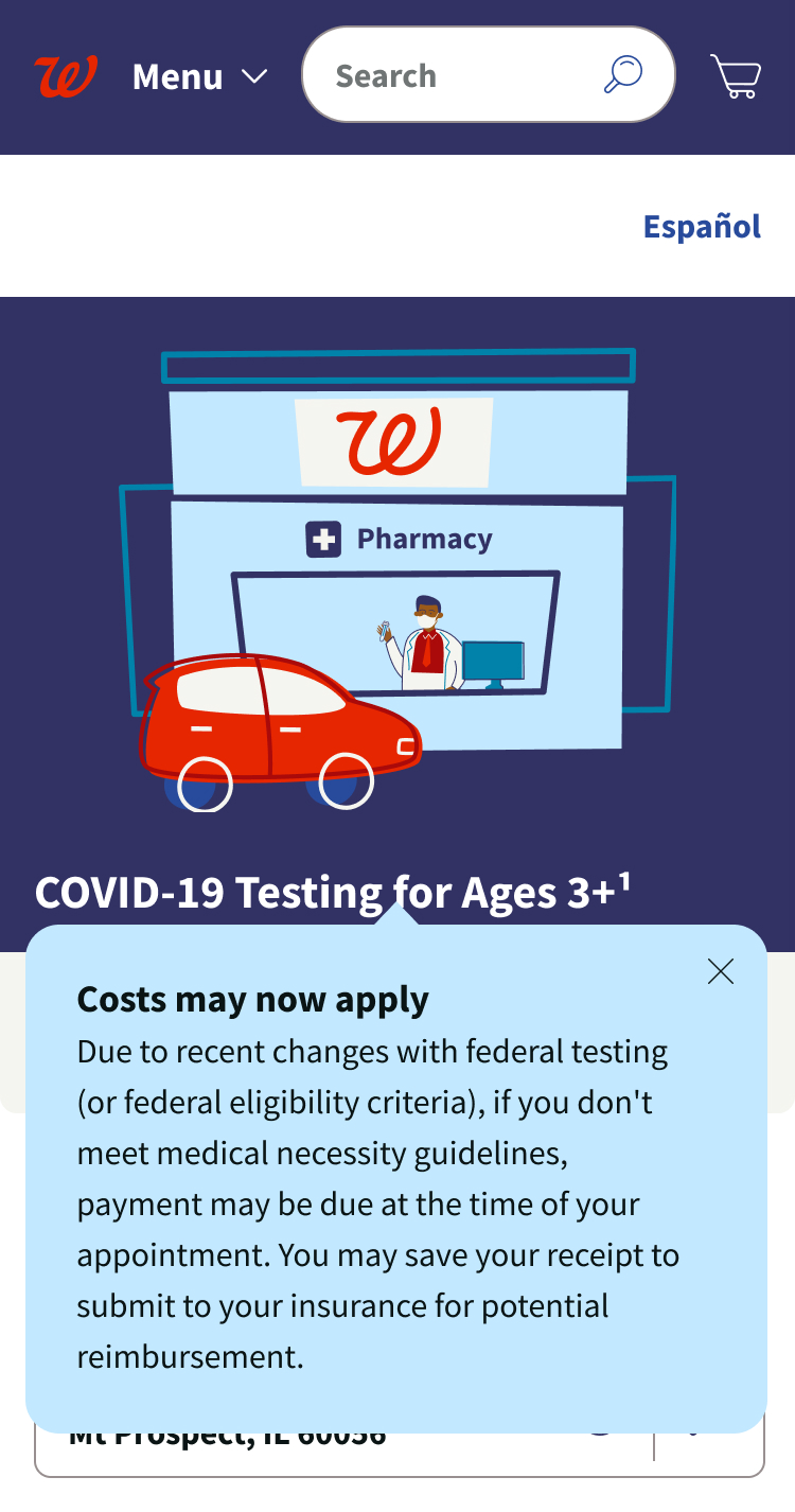
Nearly half (50%) missed the blue box about potential costs; those who noticed it did not consistently understand it
Many participants brought up payment on their own during the session relaying that someone has to pay for this health service—whether that is the federal government or an insurance plan.
Only a small percentage of patients are paying cash, from patients not meeting medical necessity.
Upsell PCR at-home collection kit banner disturbs the flow
We can’t remove the banner directly because At-home testing is the most common form of recent testing based on the data we collected. However, most users feel confused about the PCR at-home kit banner in the middle of the in-person testing schedule page.
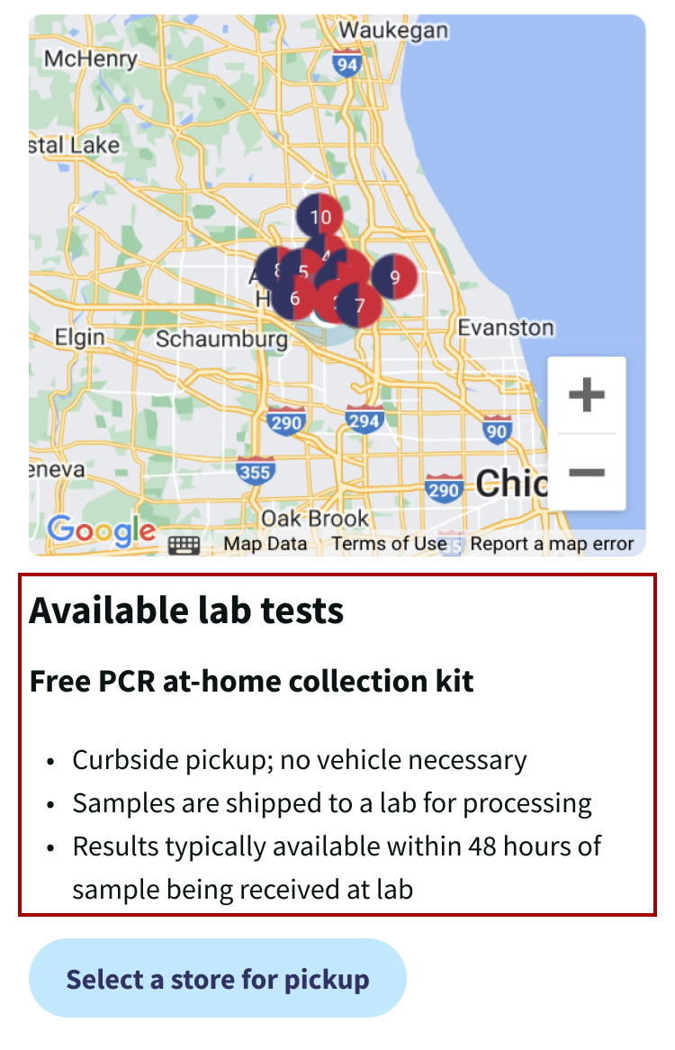
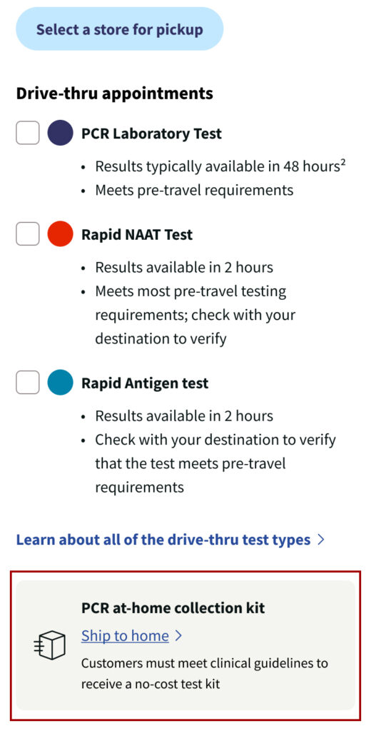
Filter on top is very similar to the selection menu on the bottom which confused the users
Due to the engineer limitation, we can change the design totally. How to adjust the design elements to make user feel less confusing is important.
Most user felt shocked when they saw the flu testing information question later of the flow.
During the user interview, users said they meeds key information about flu testing and treatment, such as cost and eligibility so they can make an informed decision
Original Task Flow

First Approach - Banner
Iteration

Final Choice
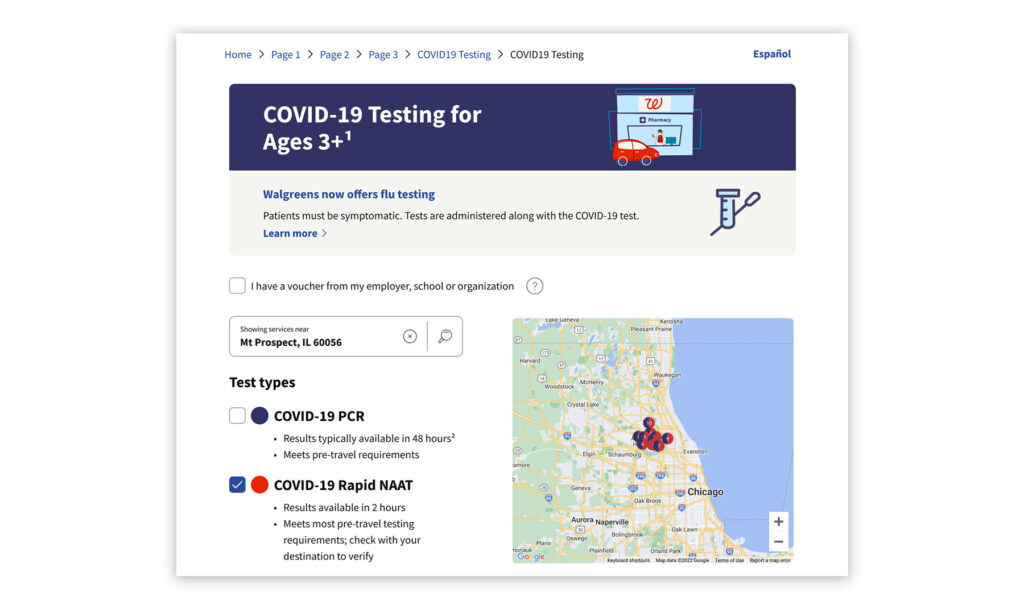
Second Approach - Flu Test Opt In Filter Section
Old Landing Page
Iteration 1
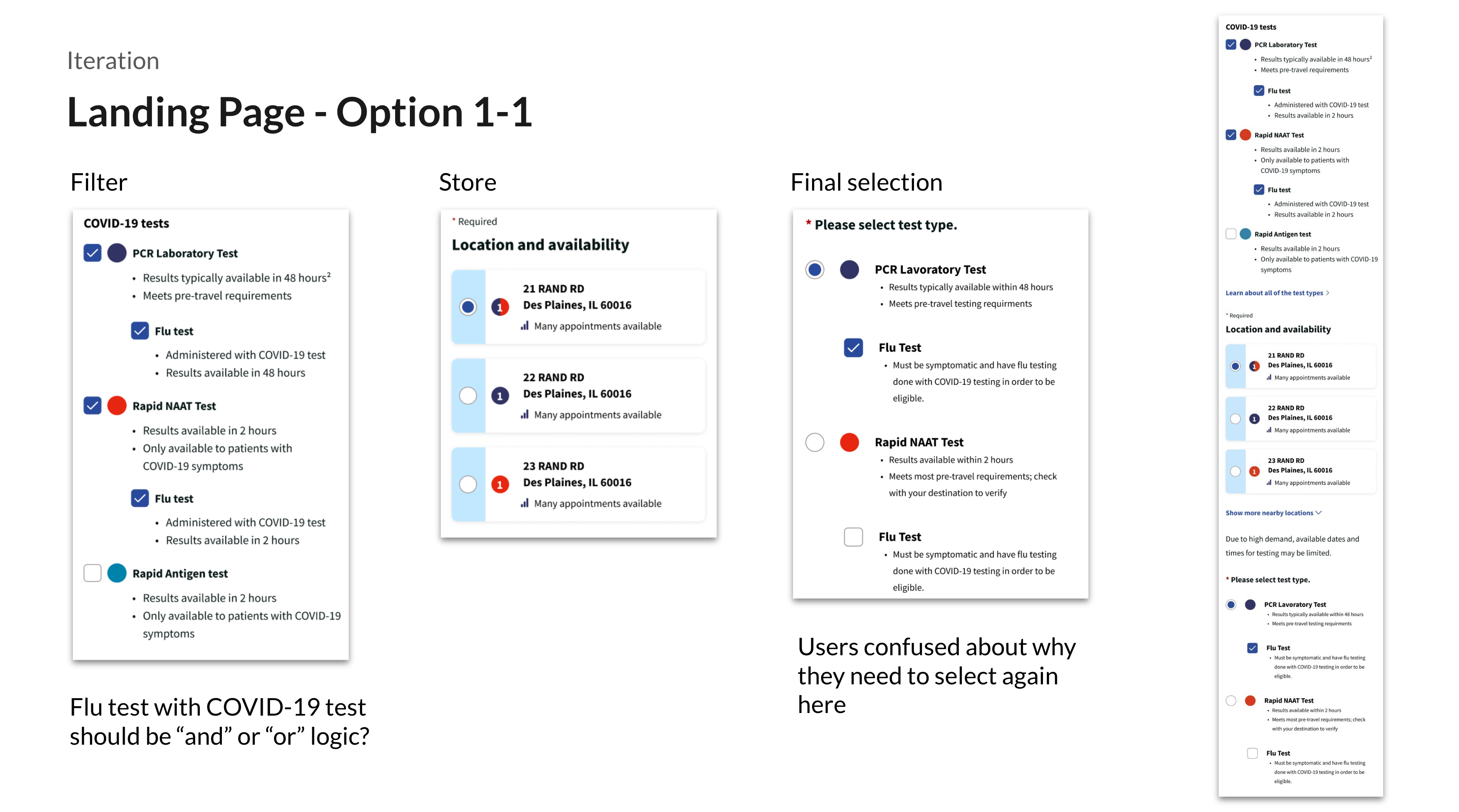
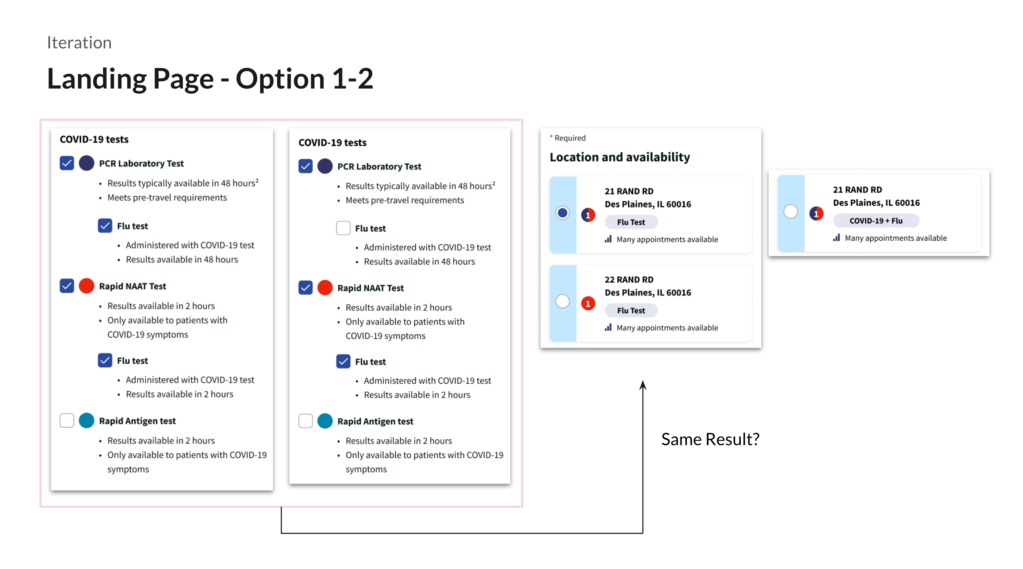
Iteration 2

Top filter
- Here we give users fewer choices, so it makes logic simpler
- We don’t mention the result time under the flu test so Walgreens team member have flexibility to give patients rapid flu or PCR flu based on store availability and patients’ need
Pros:
- Users can confirm their choice here.
- Top filter is similar to bottom selection. It easily confuses users.
- Filters already include an add-on flu test. Allowing users to select again is redundant.
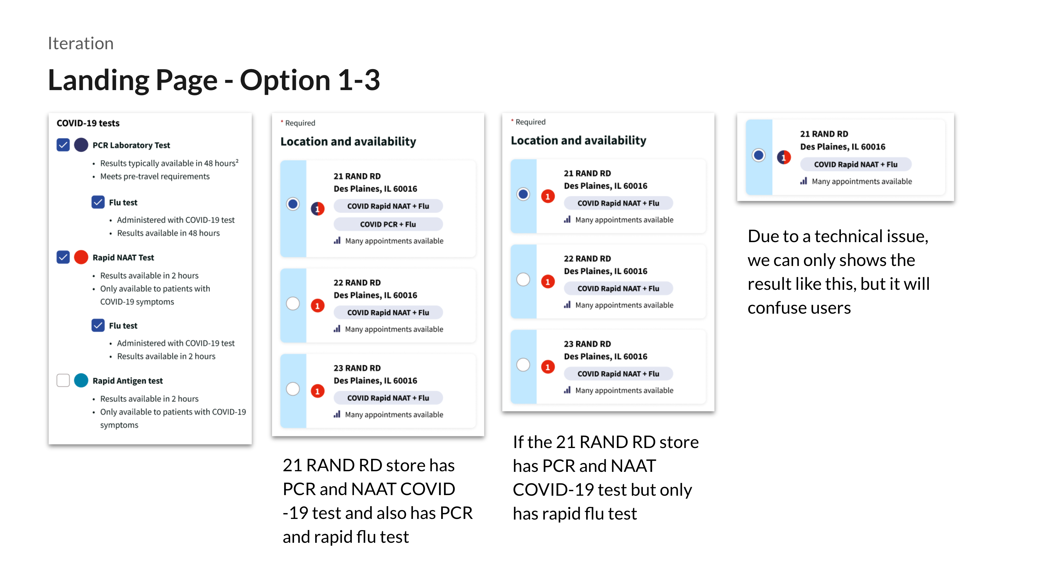
Iteration3
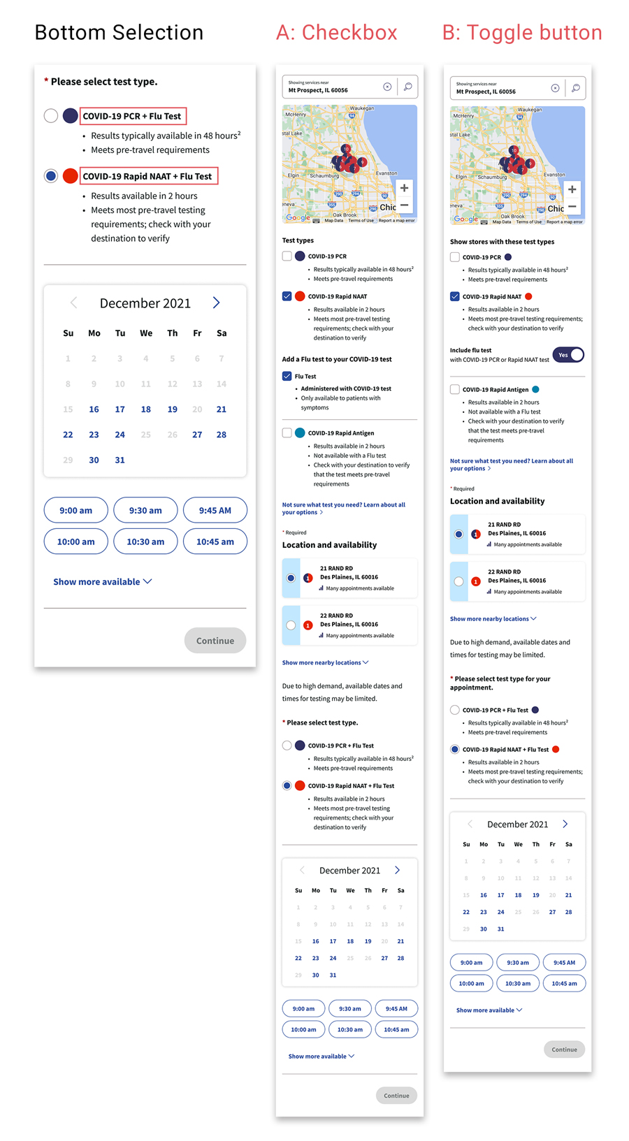
Reasons for the decision of bottom selection:
- Users may still not be eligible for the flu test later.
- Users can still opt-out flu test in the later flow of scheduling.
- We also conducted quick survey research with users and most of them understand that they select flu on the top means they opt-in to the flu test.
Research and Finding
Those completing tasks with the toggle design did express a greater degree of certainty about what COVID tests they might pair. By contrast, those completing tasks with the check-box design found it easier to understand eligibility—again due to the text underneath the option which led them to read what was under all the checkboxes.
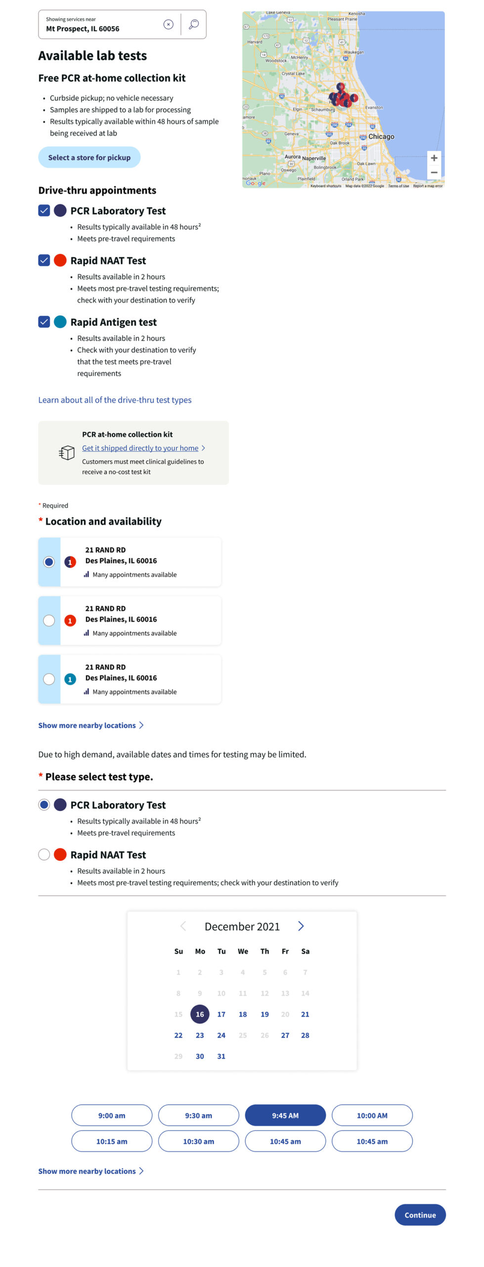
Third Approach - Minimize the at-home kit banner and move it to the bottom.
Final Design

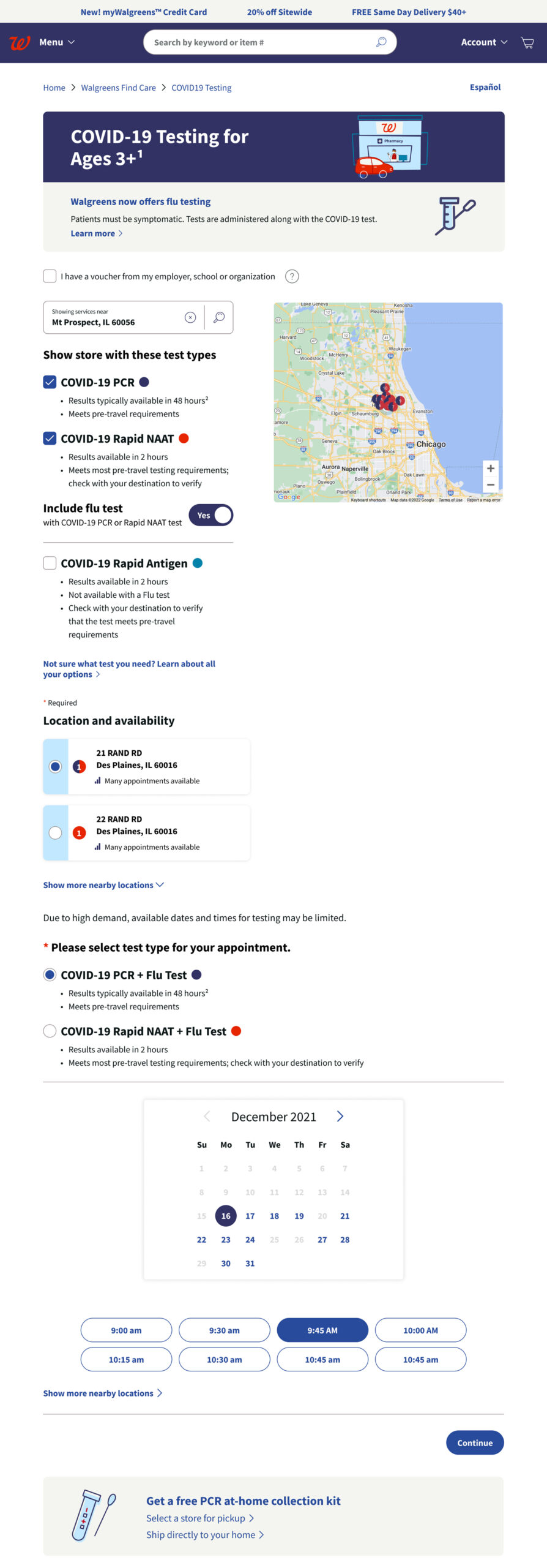
Landing Page: happy path selecting

No store available within distance


Final Impact
- Users notice the flu test option at Walgreens and able to know the eligibility
From the previous research, users would be surprised they could do a flu test near the end of the flow. The updated design attracts more users to notice the option. - More people book Covid and flu testing
Within one month of launching the flu testing feature and updating the design, the completion rate of the testing scheduler landing page and end-to-end testing scheduler site increased by 2% - Users won’t feel confused about OTC collection kit in the middle of the landing pageFrom the original research,
From the previous research, users feel so confused why there are two section above and below the test filter.


