Merchant Dashboard
Impact
- Reduced engineer workload by 10% by removing manual work such as keying data and sharing data with the other teams.
- Saved 50% of the operation team’s time spent managing deliveries because they don’t need to call the drivers individually.
- Integrated data helped the team quickly analyze delivery rate, on-time delivery rate, average load time, and unload time.
Overview
The customer and merchant apps generate significant data. In the early phase, engineers directly looked up this data from the back end.
As the team expanded and fleet numbers increased, we needed something to track all the data and let the team manage all the fleets, trips and routes directly without getting access through engineers.
Also, the dashboard could potentially be used by our client merchants in the future.
The Problem
- Engineers waste time looking up data.
- Too much work to import and export order and trip information by manually typing.
- Too many detailed components and information that needs to be organized and stored.
- Hard to manage all the fleets and drivers at once.
The Challenge
Need to create a simple and clean tracking and management tool for our operational team from scratch.
It should integrate different data from the merchant app, the customer app and the vehicle. Provide a solution to create and import all the information quickly. Show the status of deliveries and fleet.
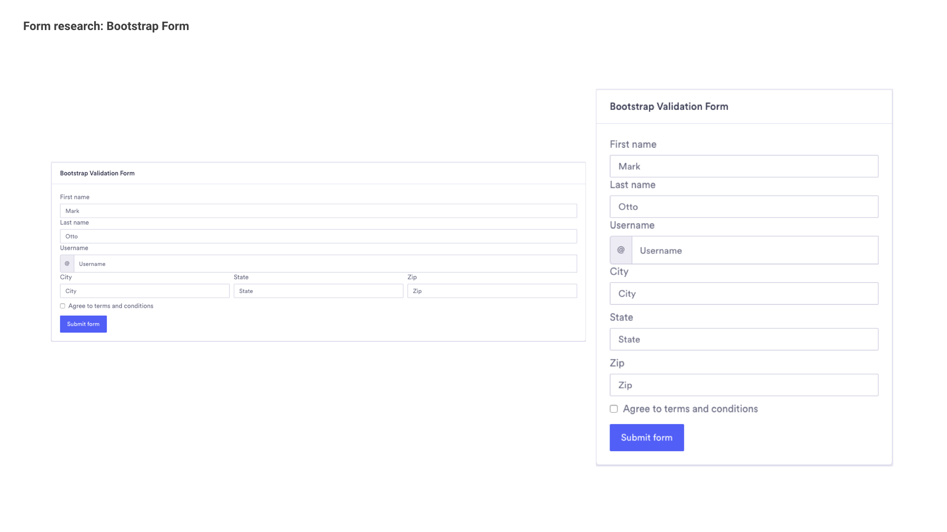
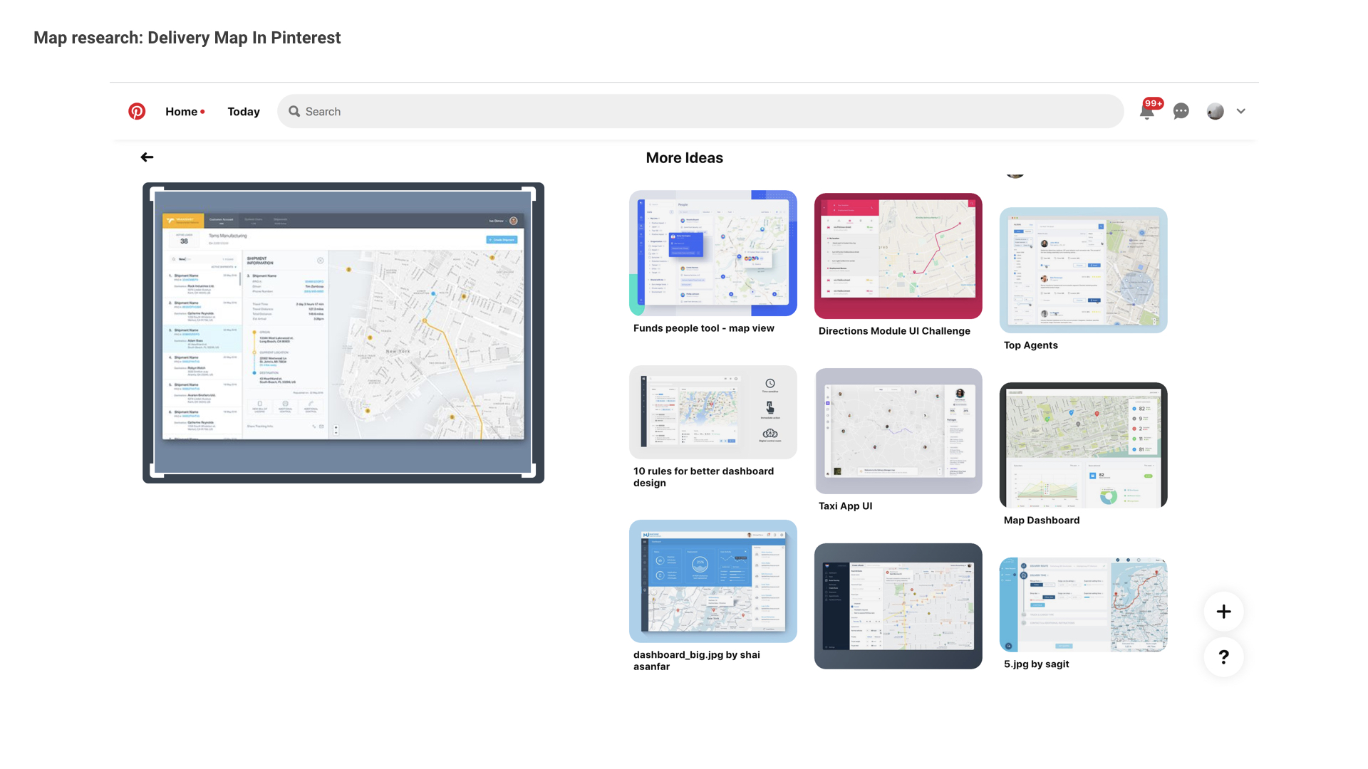
Inspiration Analysis
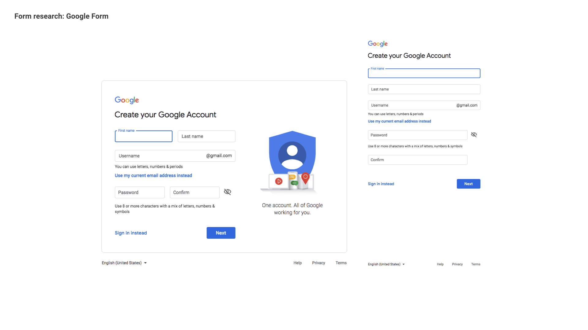
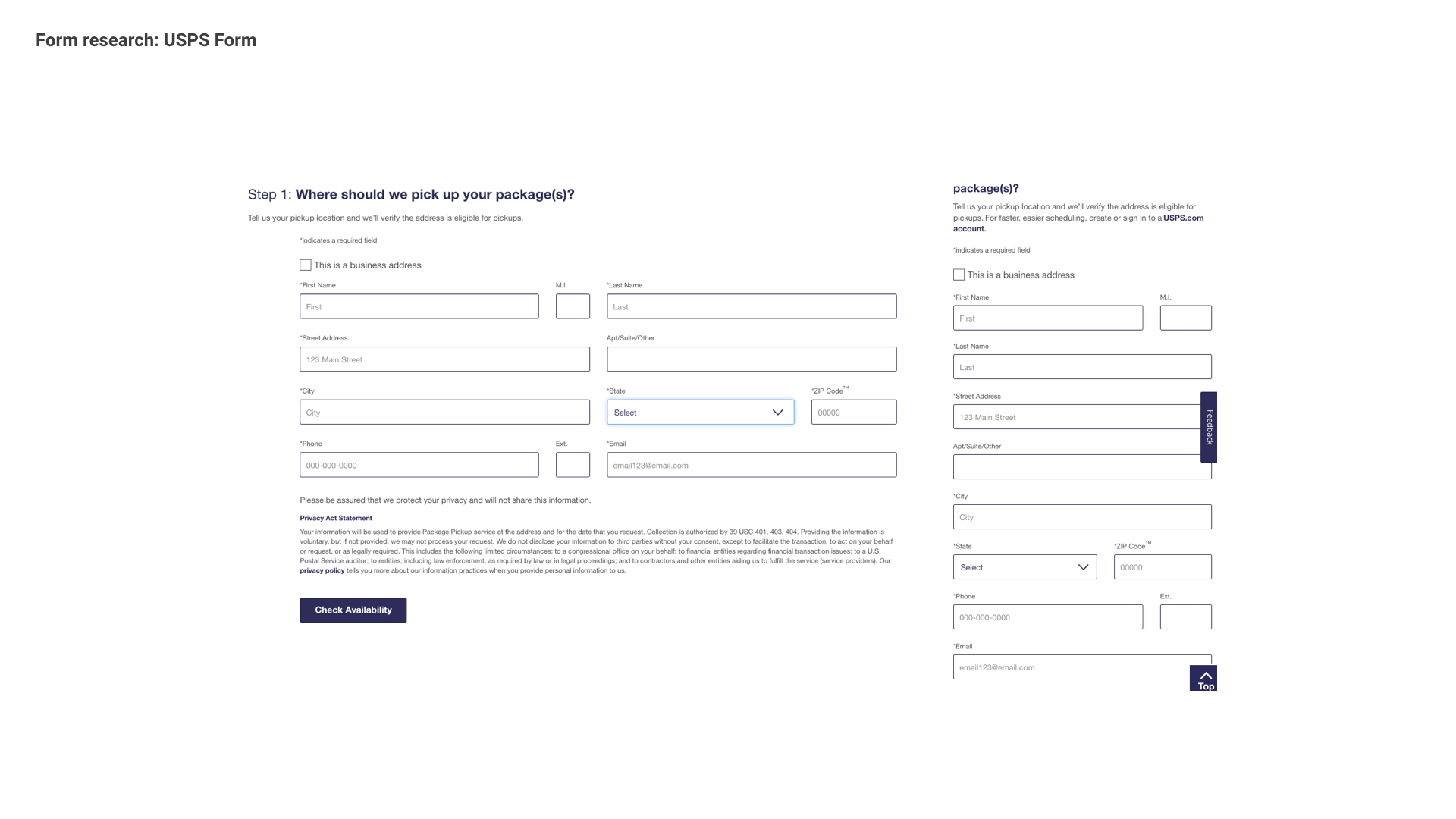
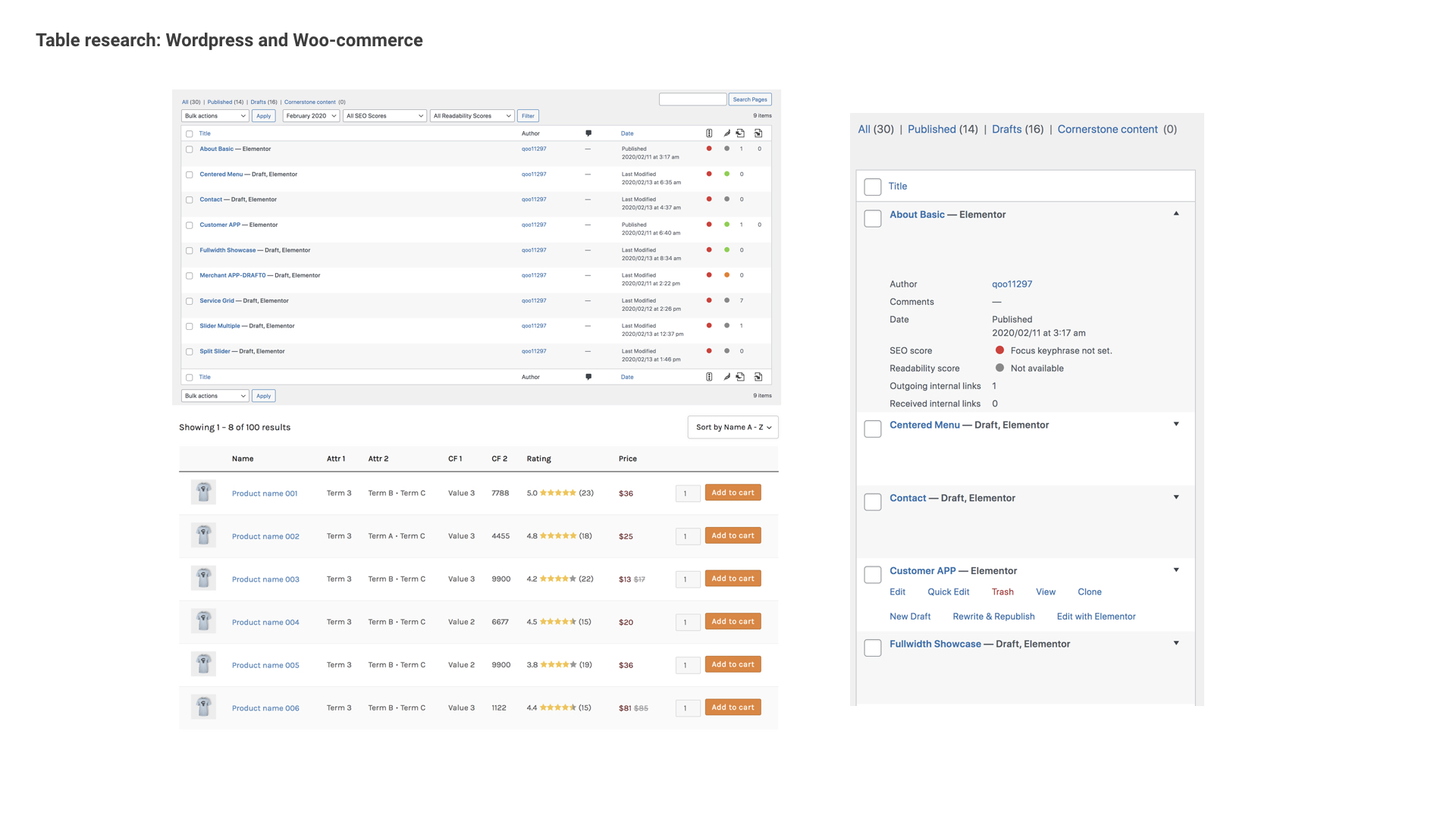
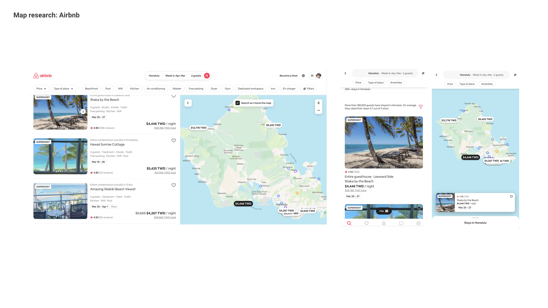
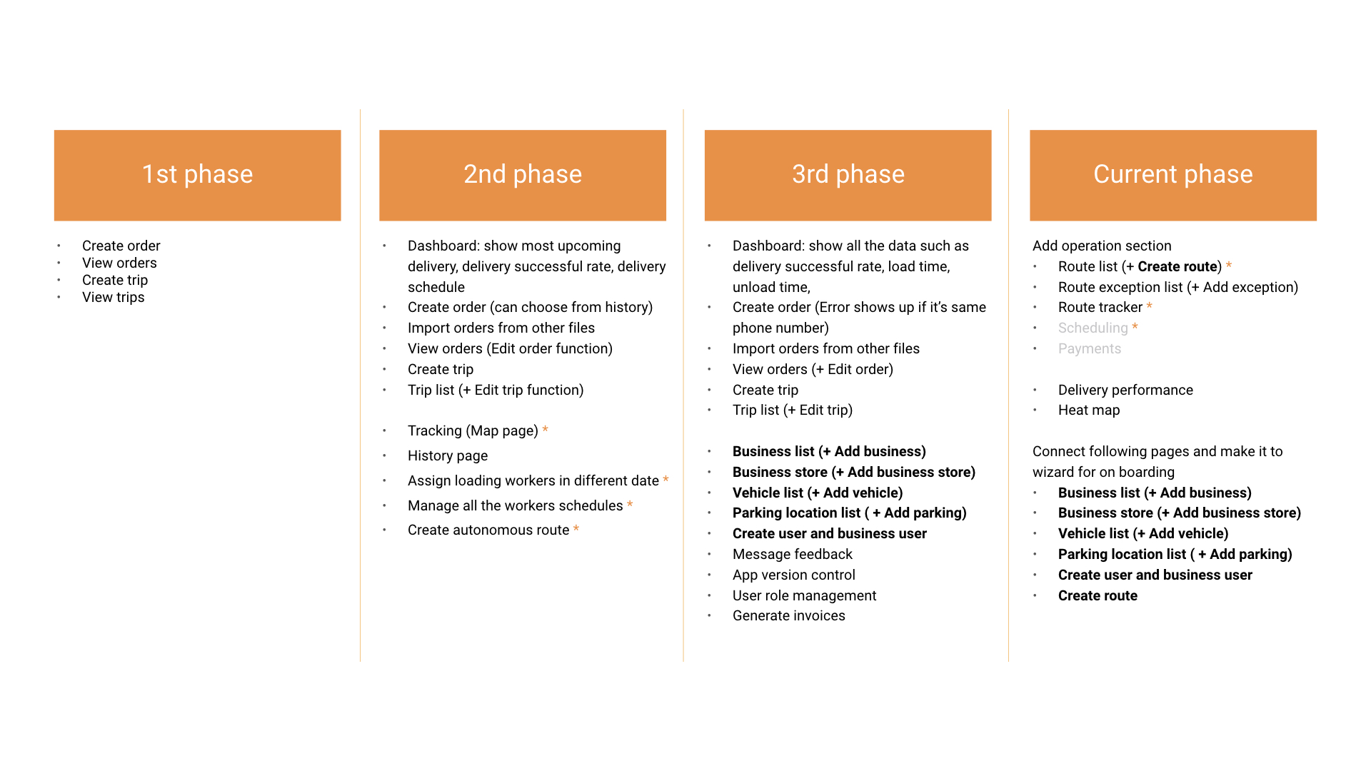
4 Phases Development
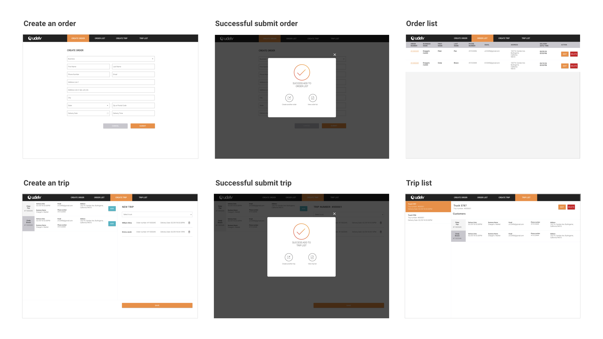
1st Phase
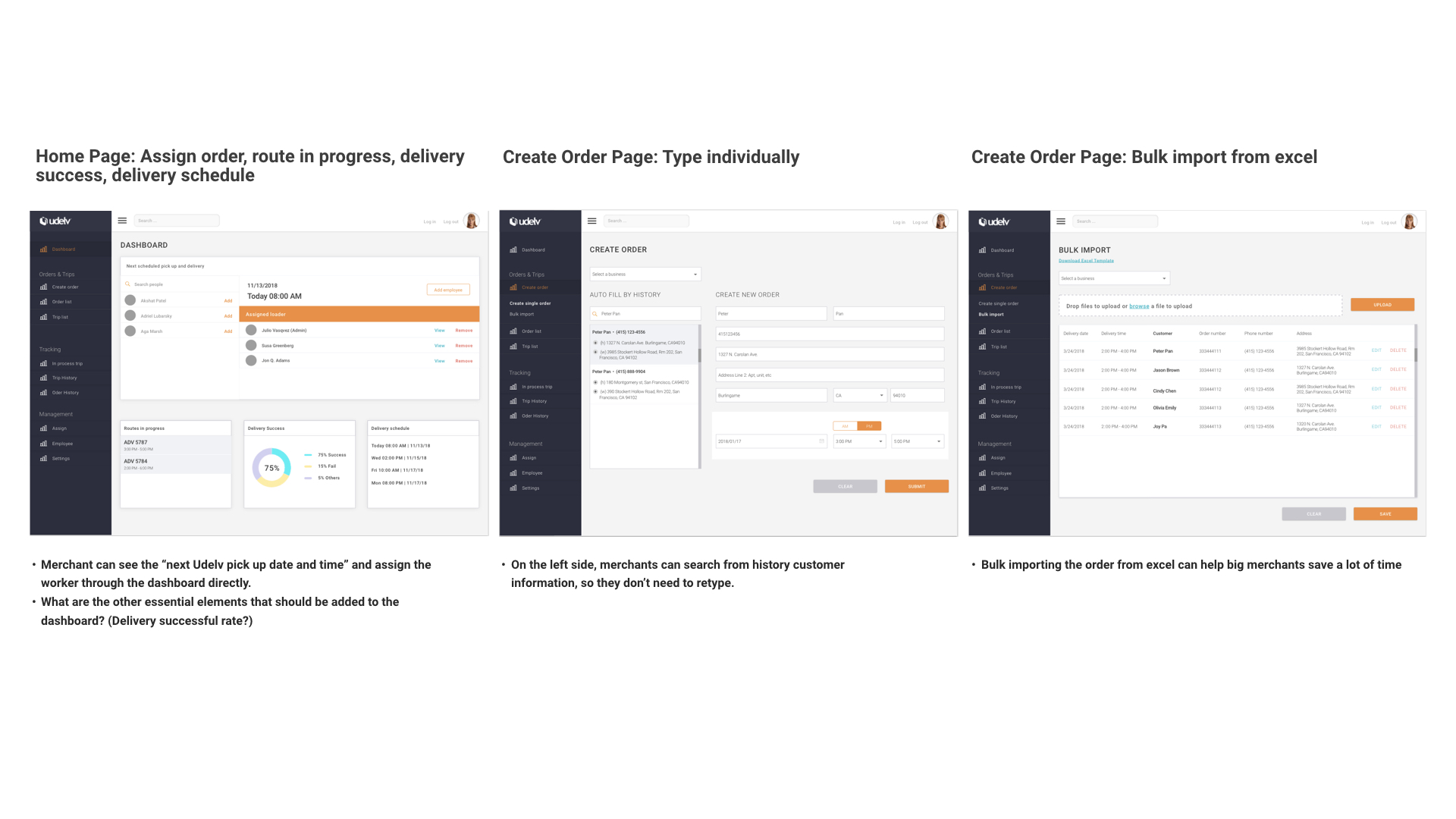
2nd Phase: Explore Possible Pages And Features
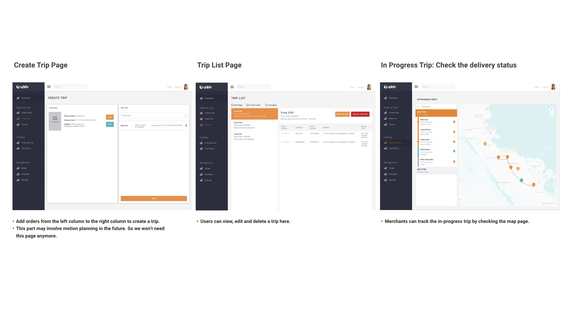
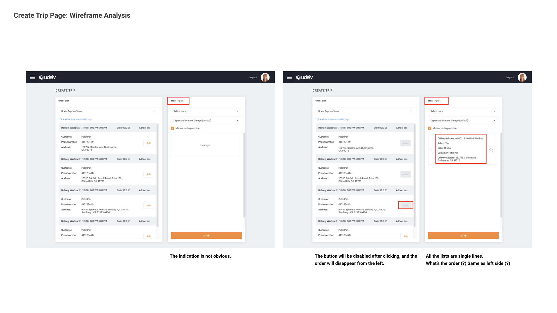
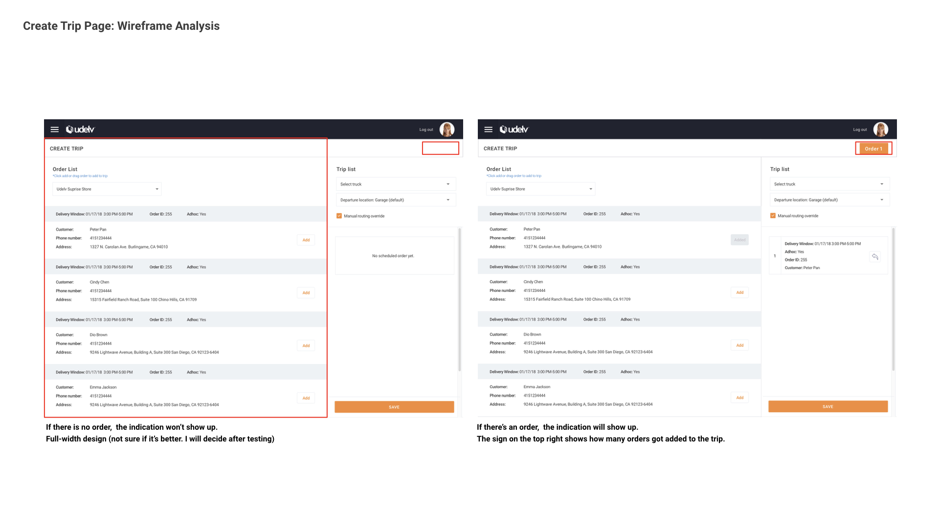
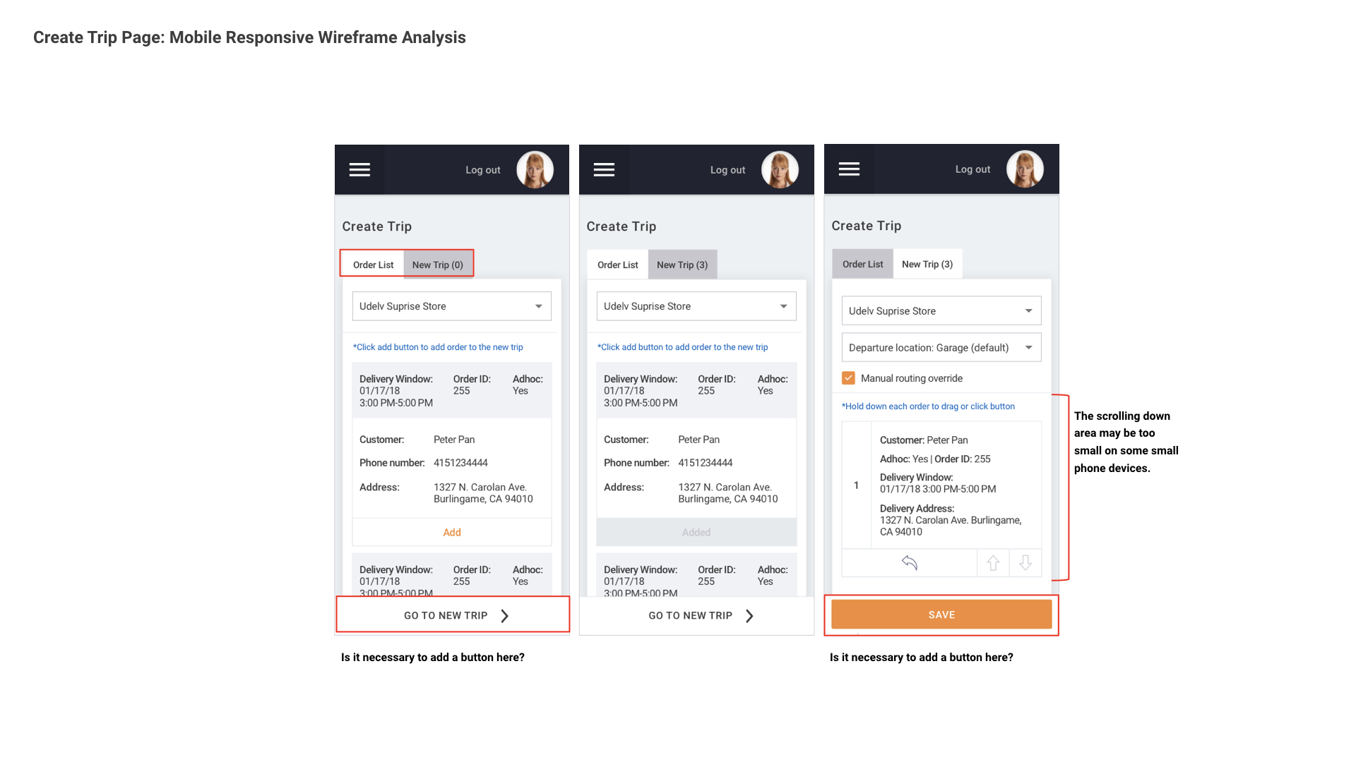
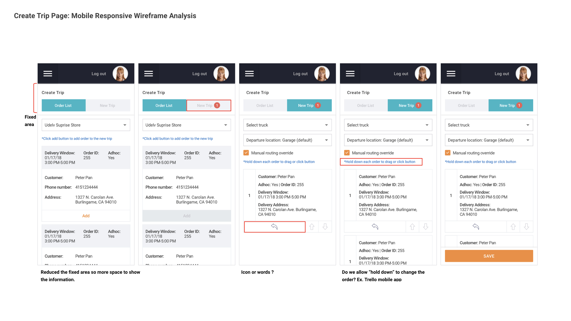
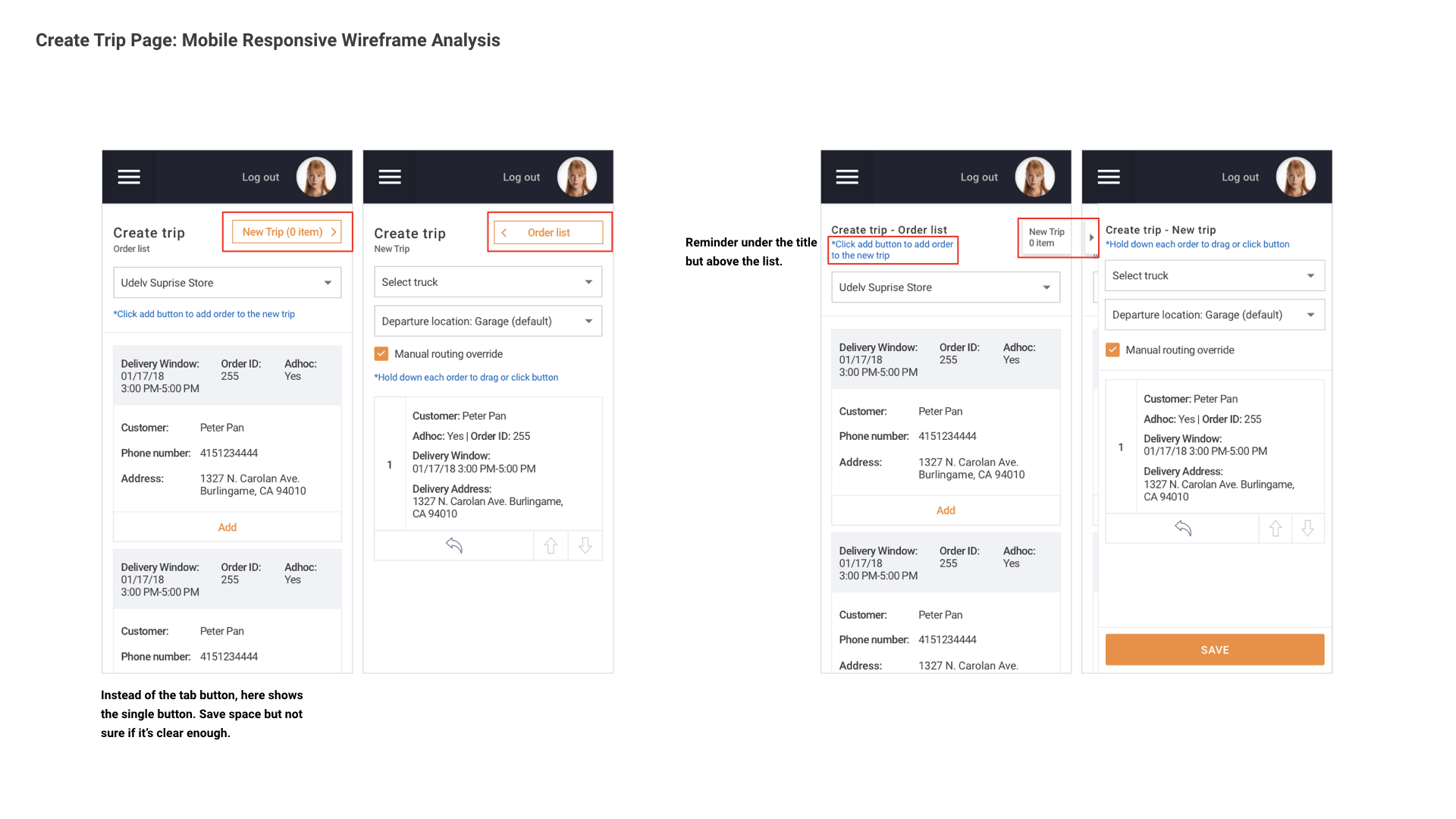
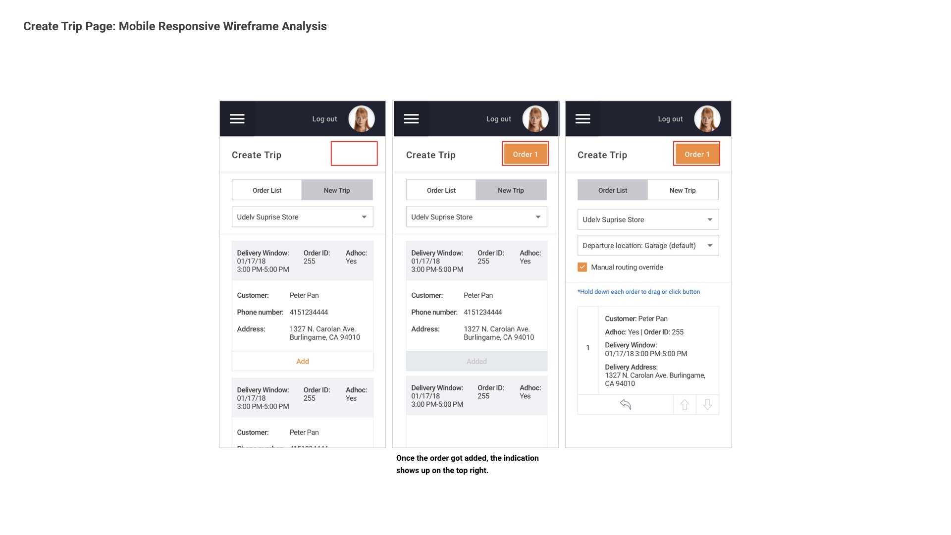
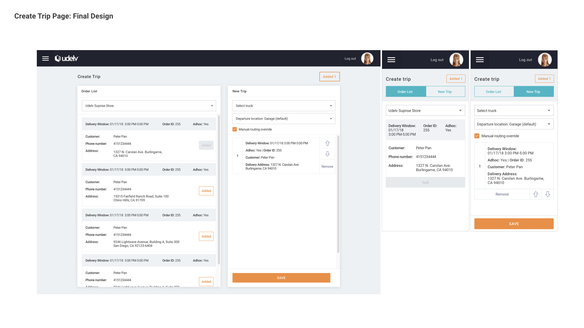
3rd Phase: Detailed Refined, Responsive Design
Current Phase: Wizard Flow And Operational Section
Wizard User Flow
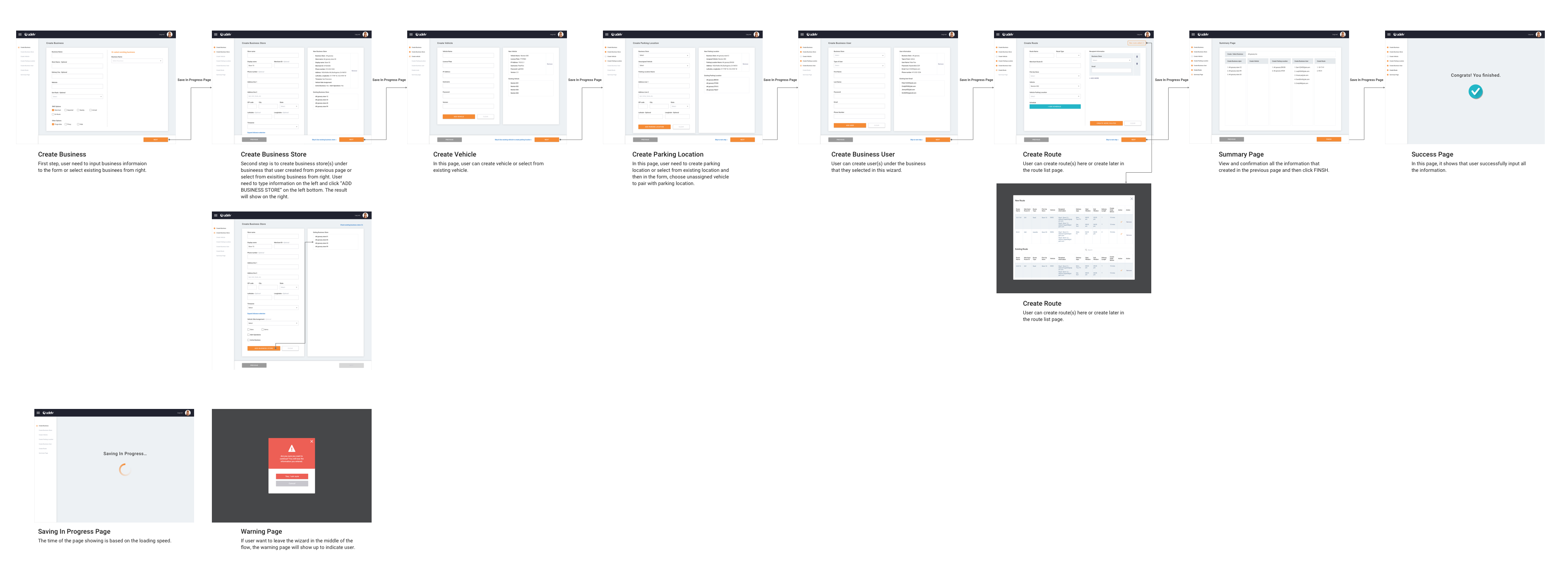
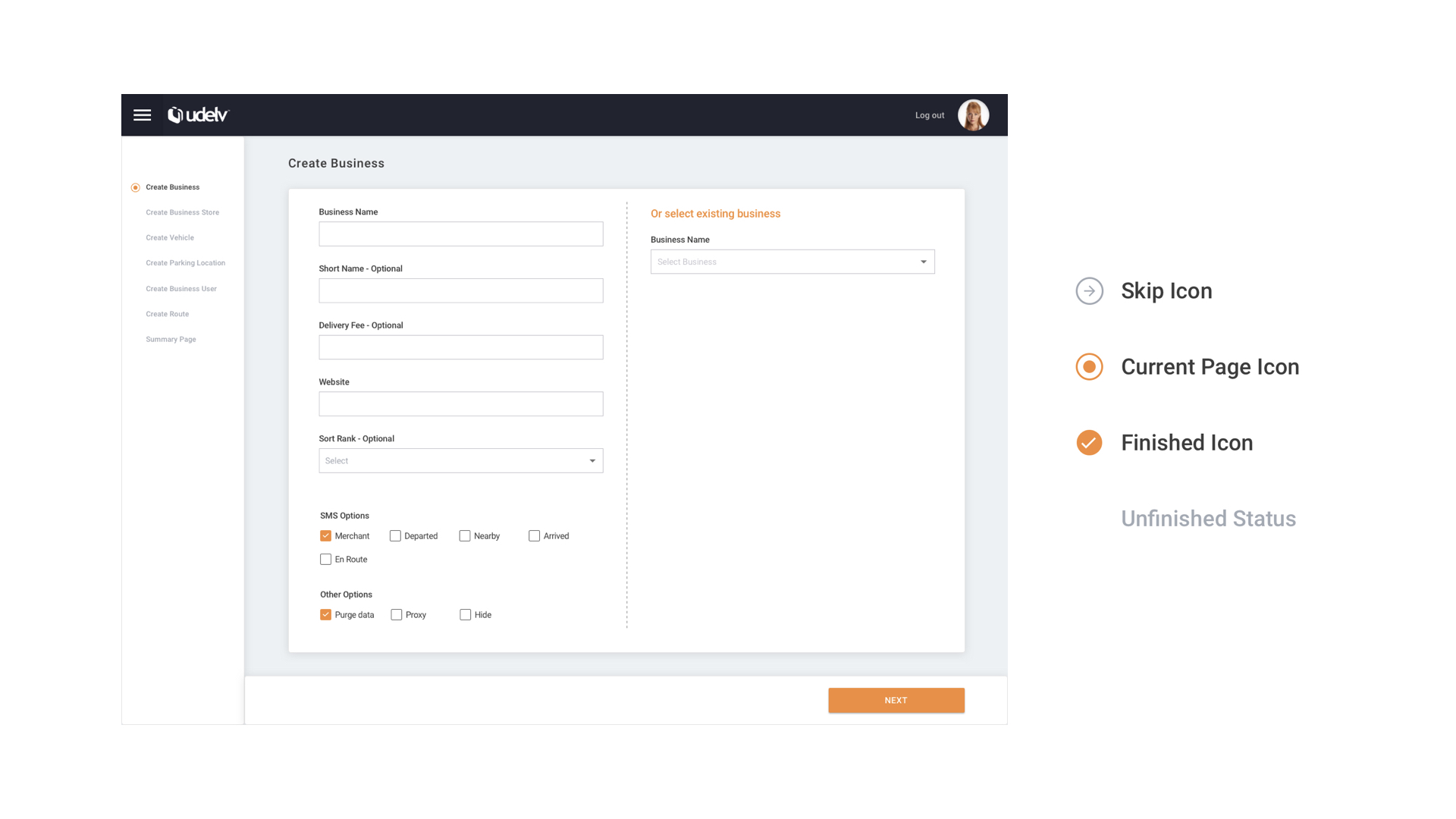
In this project, the key focus is to provide a comprehensive on-boarding experience for users. The consistent user interface, better guidance and clear indication will help first-time users finish this on-boarding wizard.
Operational Section User Flow
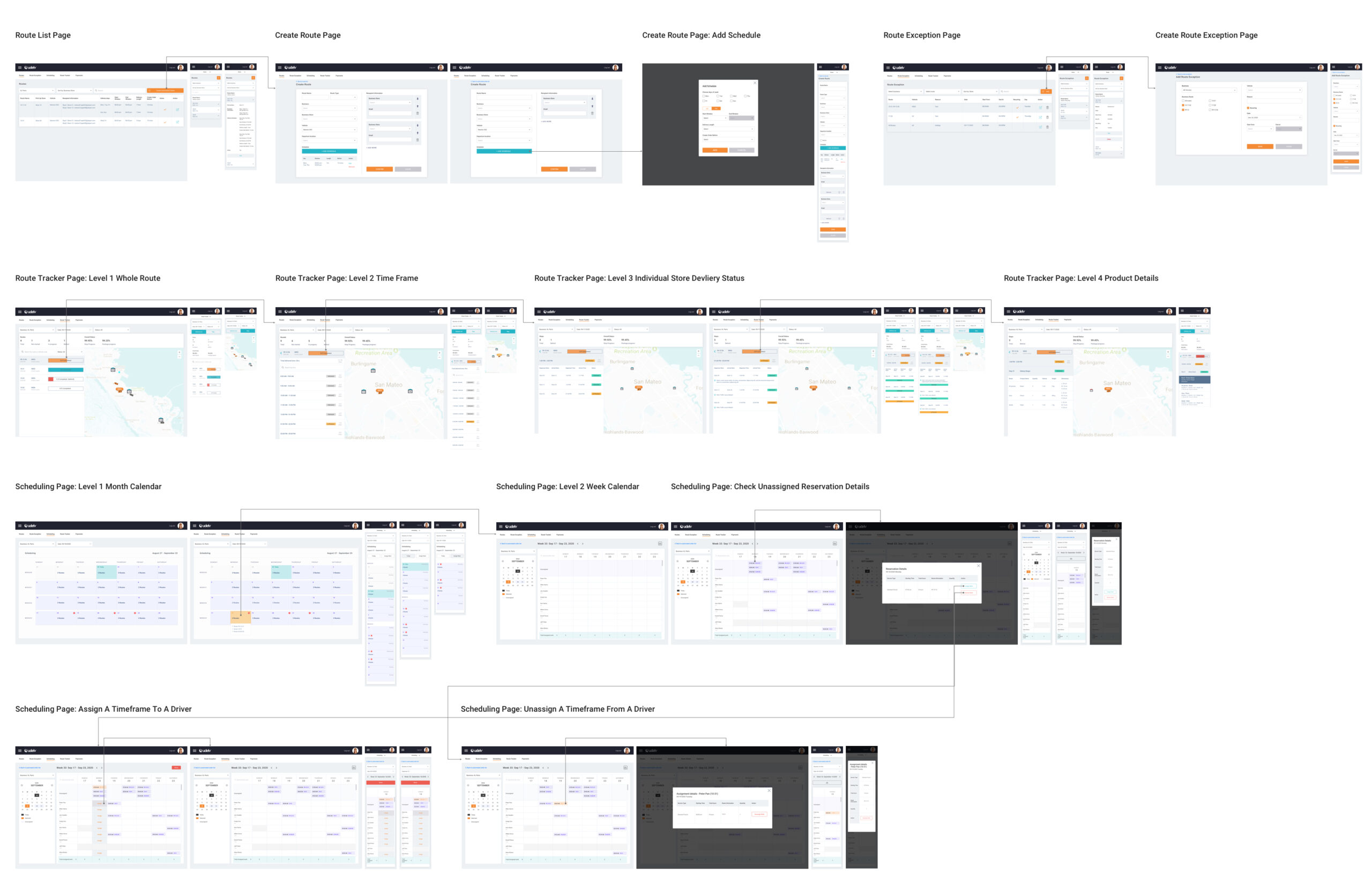
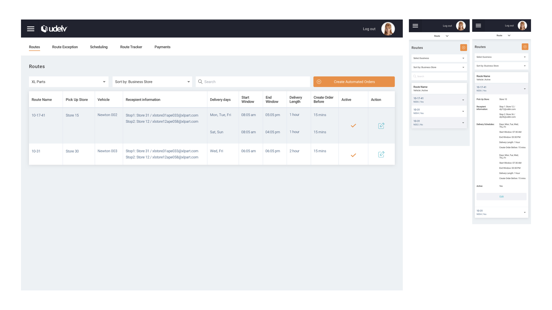
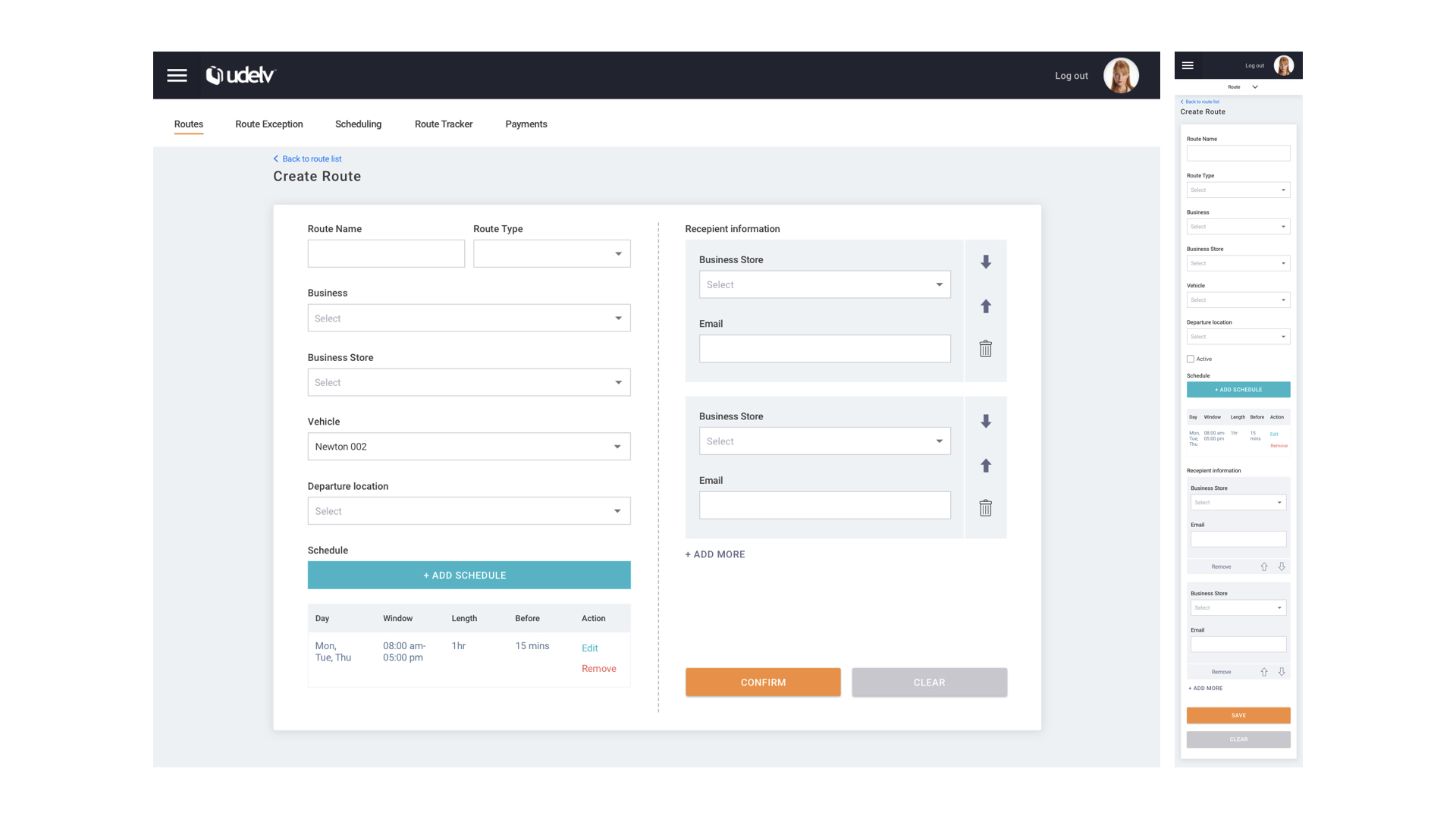
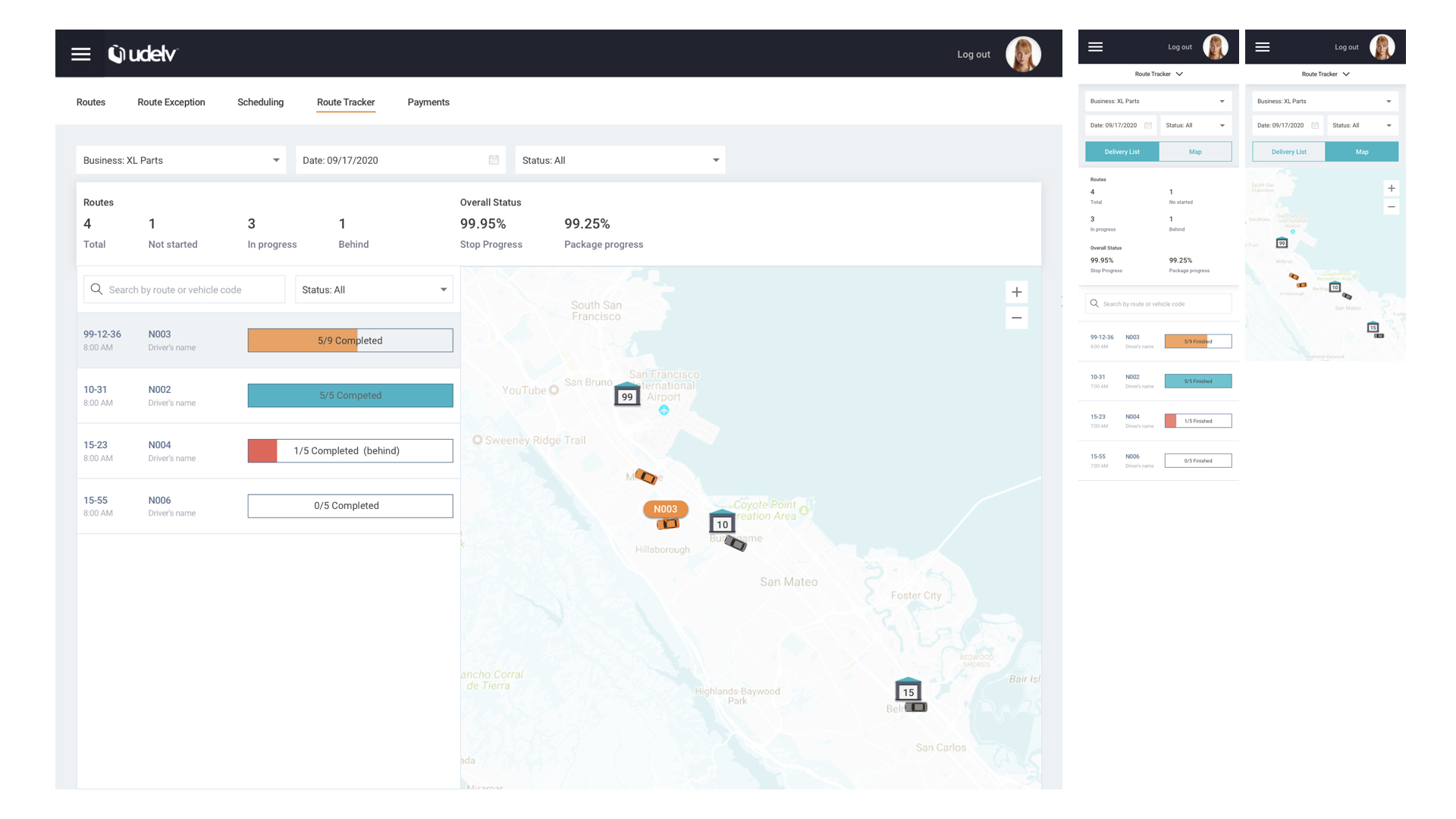
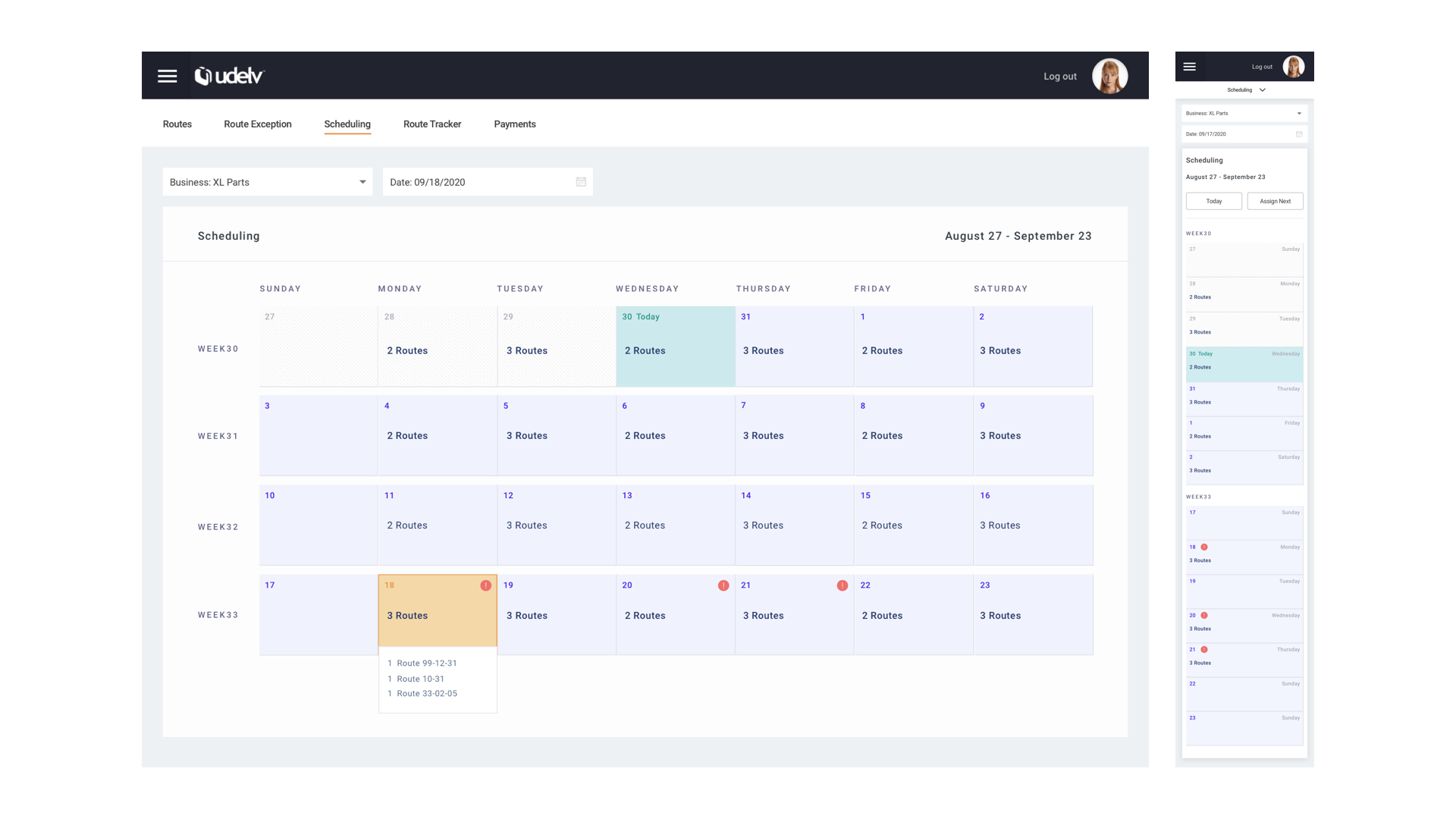
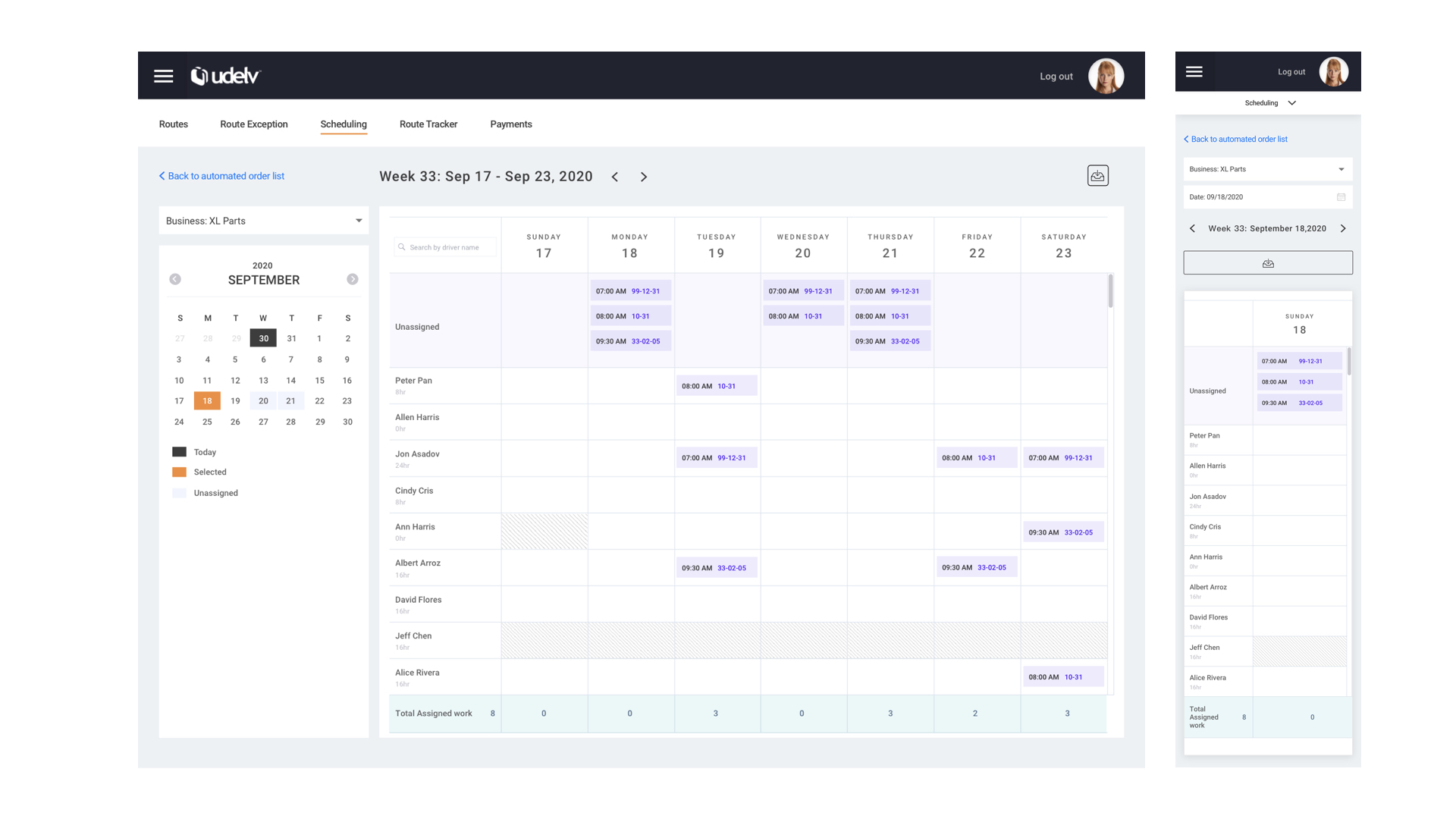
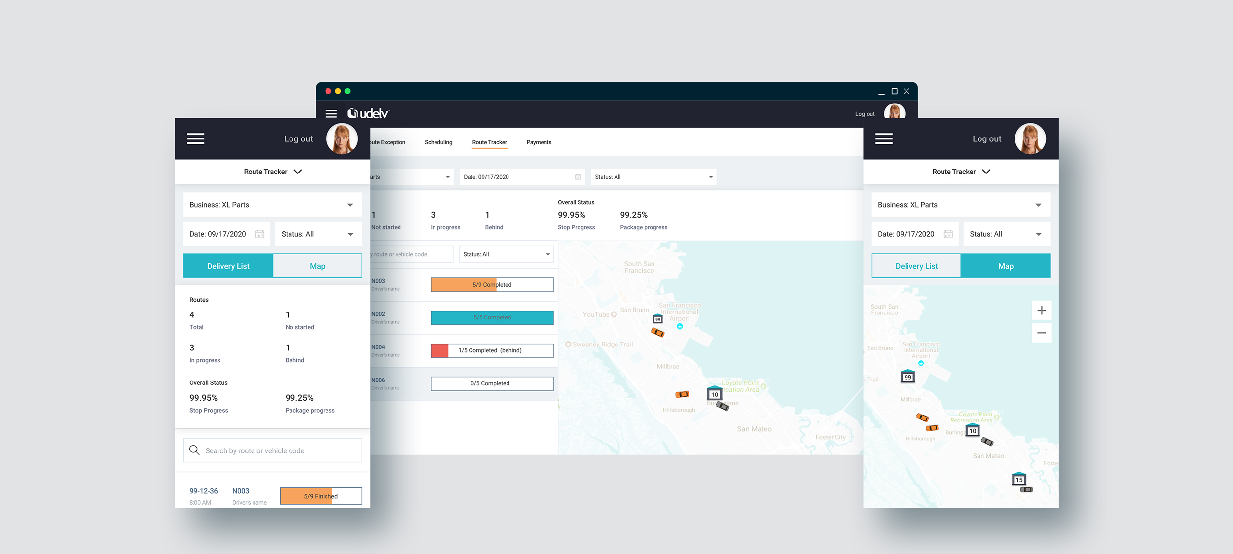
To help the operational team better manage all the fleet, deliveries, and drivers and show the integrated information, we create a separate section. At the same time, responsive experiences are also made. However, mobile users will have constraints to typing and seeing much information on a small screen. Tabs element on the top can help users switch the map view and content view. Filter selection and search bar can also help users easily see the information they need on the mobile device.
