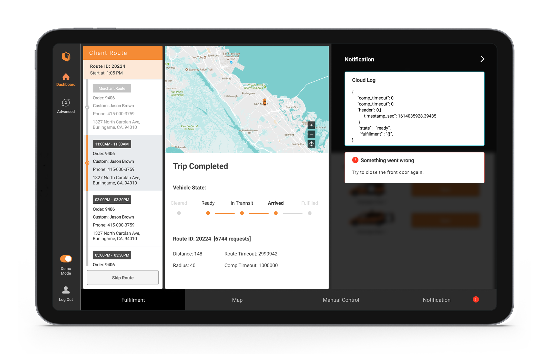
Driver Dashboard

Impact
Clear for first time drivers
Most first time users couldn’t get the idea of the original driver dashboard. After redesign, first time users could quickly get the basic idea of the dashboard.
I enhanced the task success rate from 5% to 85% and reduced errors made by drivers from 45% to 10% after redesigning the dashboard.
Efficient for engineer team
The clear notification interface that I redesign helps engineers fix issues quickly.
Overview
The teleoperation system is important to complement autonomy while the technology is maturing.
The driver dashboard is part of a teleoperation system that allows engineers and drivers to track real-time data, report issues, emergency remote control and fix errors for additional safety. Loading and unloading operations are remotely controlled for assistance and troubleshooting.
The Problem
- The current interface is not clear for driver/first time users to use.
- The current website interface is not the right format for the monitor in the vehicle.
- It’s hard to demonstrate the concept to investors.
- Engineers need more features in the dashboard but they are not sure where is the best place to add them.
The Goal
- To create an easy and simple interface for the driver and first time user to understand how to override state, solve simple problems such as opening the door manually and report technical issues to the engineers through the monitor in the vehicle.
- Engineers can better control the panel and debug the issues in real time.
- To have a clear and simple dashboard that helps investors get the idea of the product immediately.
Analyze Original Dashboard
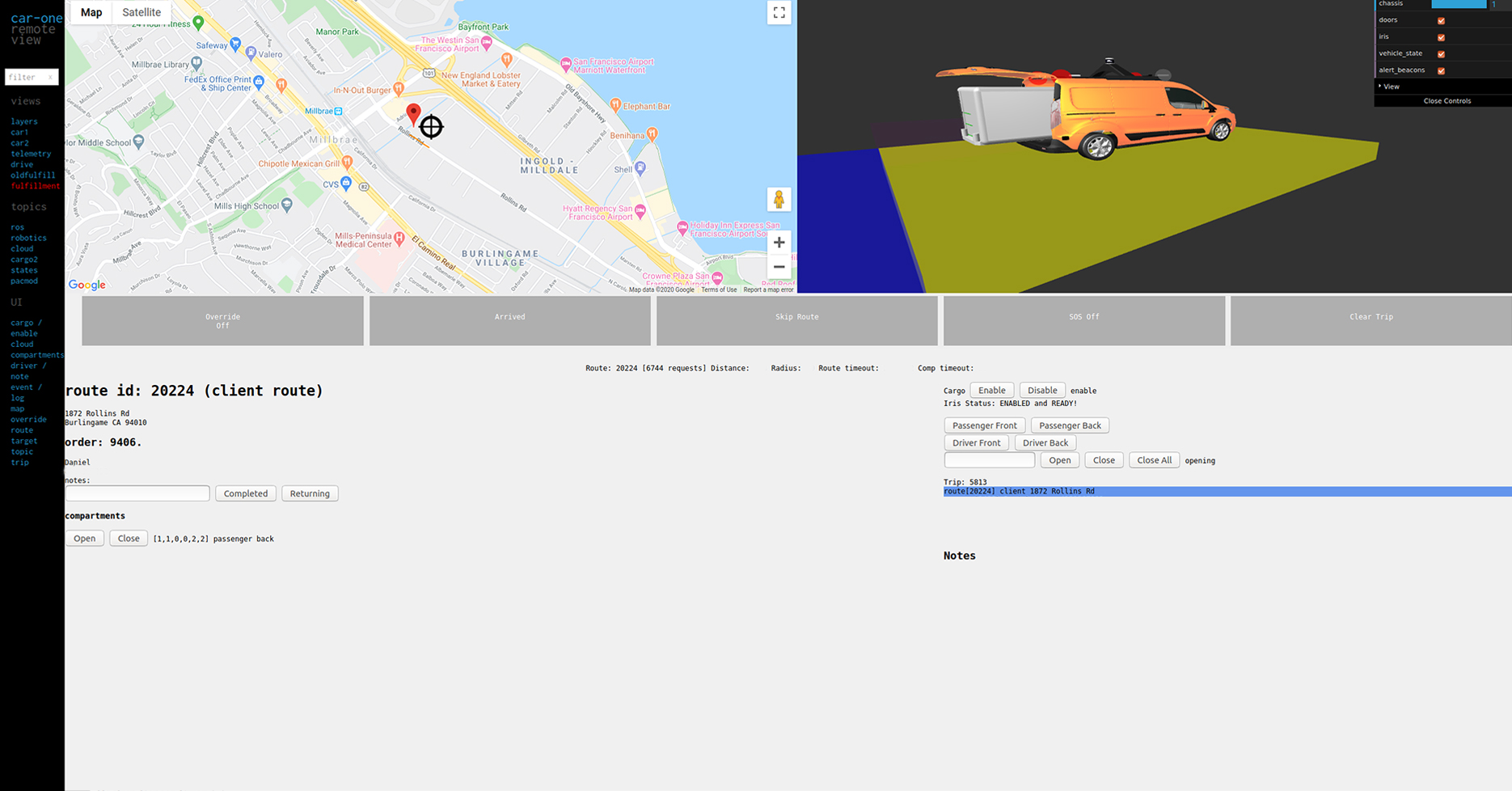
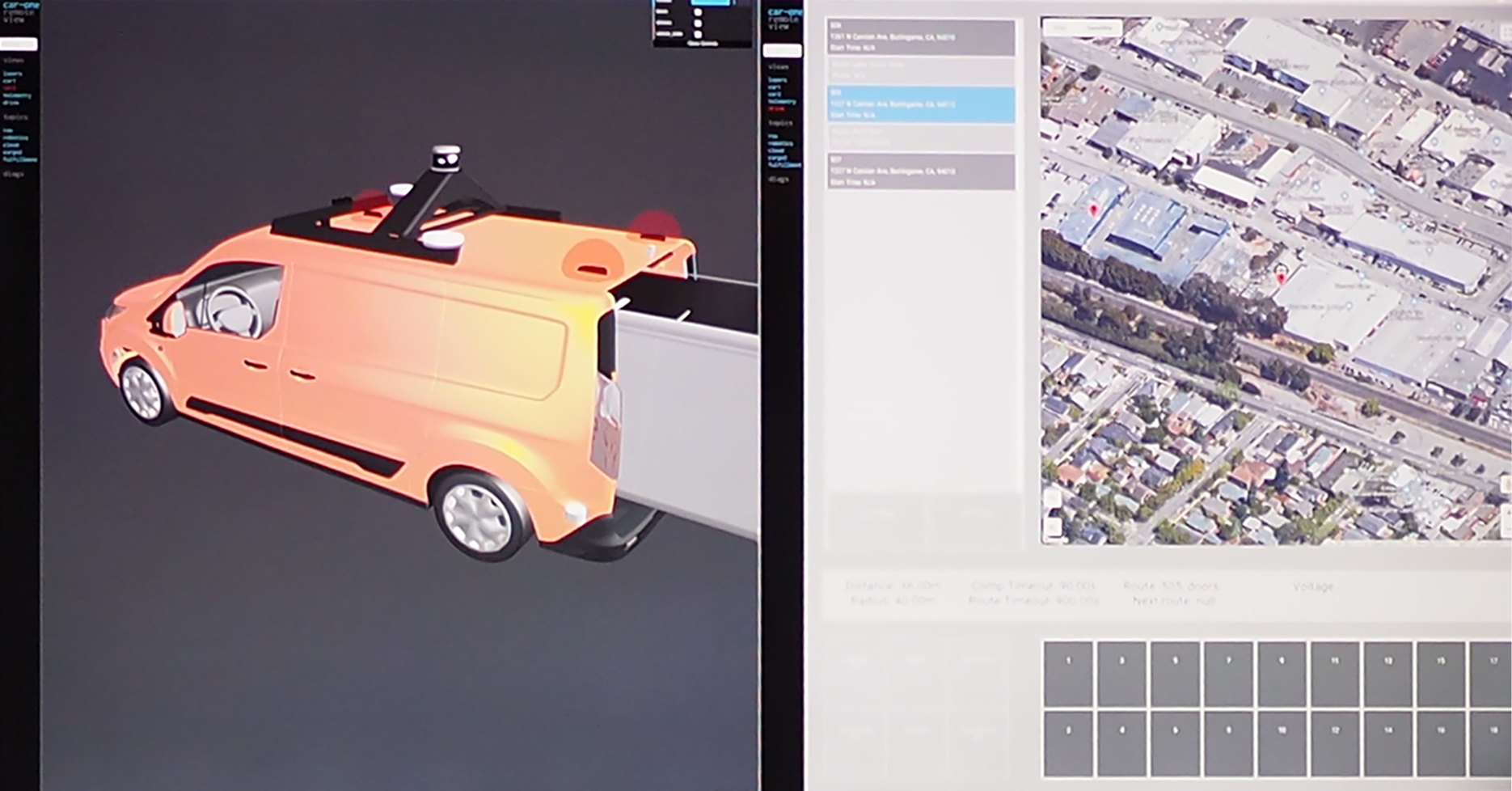
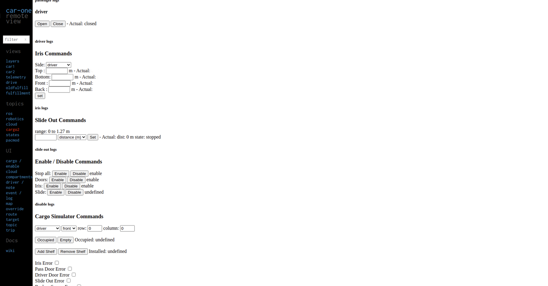
ASK QUESTIONS
- The meaning of each button.
- The meaning of each content.
- The action after the button is clicked.
- Can the action be undone?
- Is it necessary for the design elements to be there?
- What’s the goal of each task flow?
Observe From Analysis
ENGINEERS’ NEED
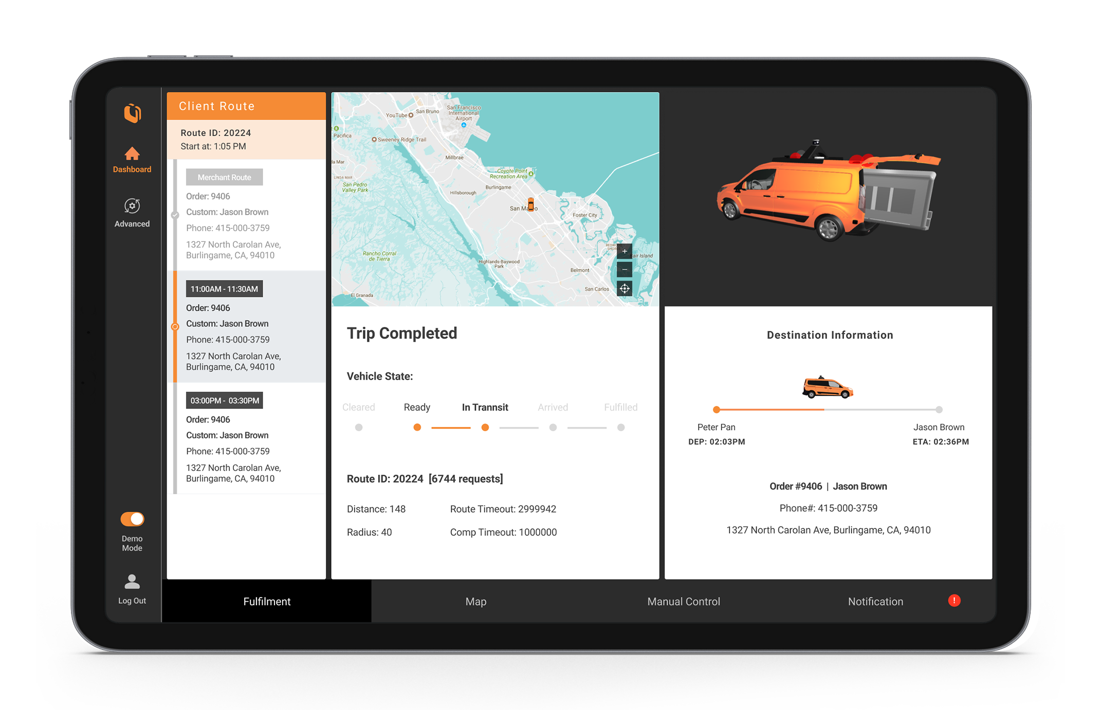
- Know delivery and trip status.
- Show vehicle state and fulfillment state clearly.
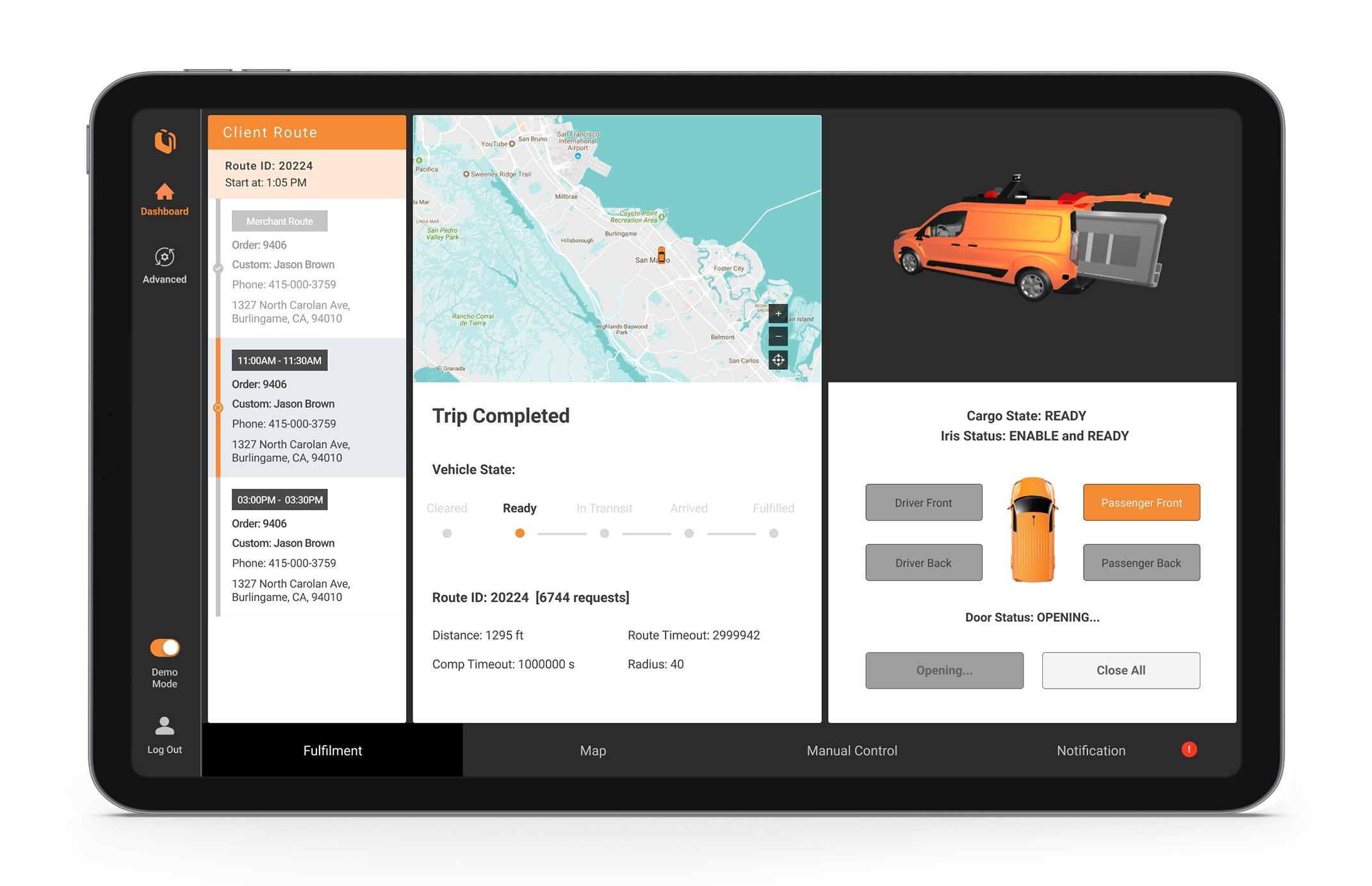
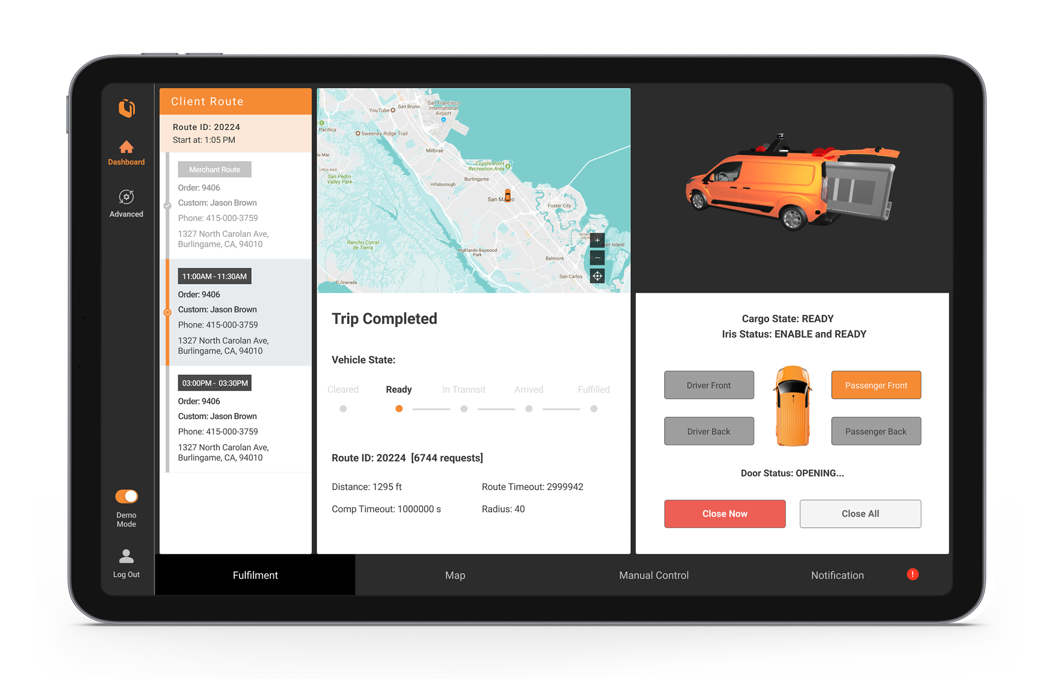
- Can manually open front and back door.
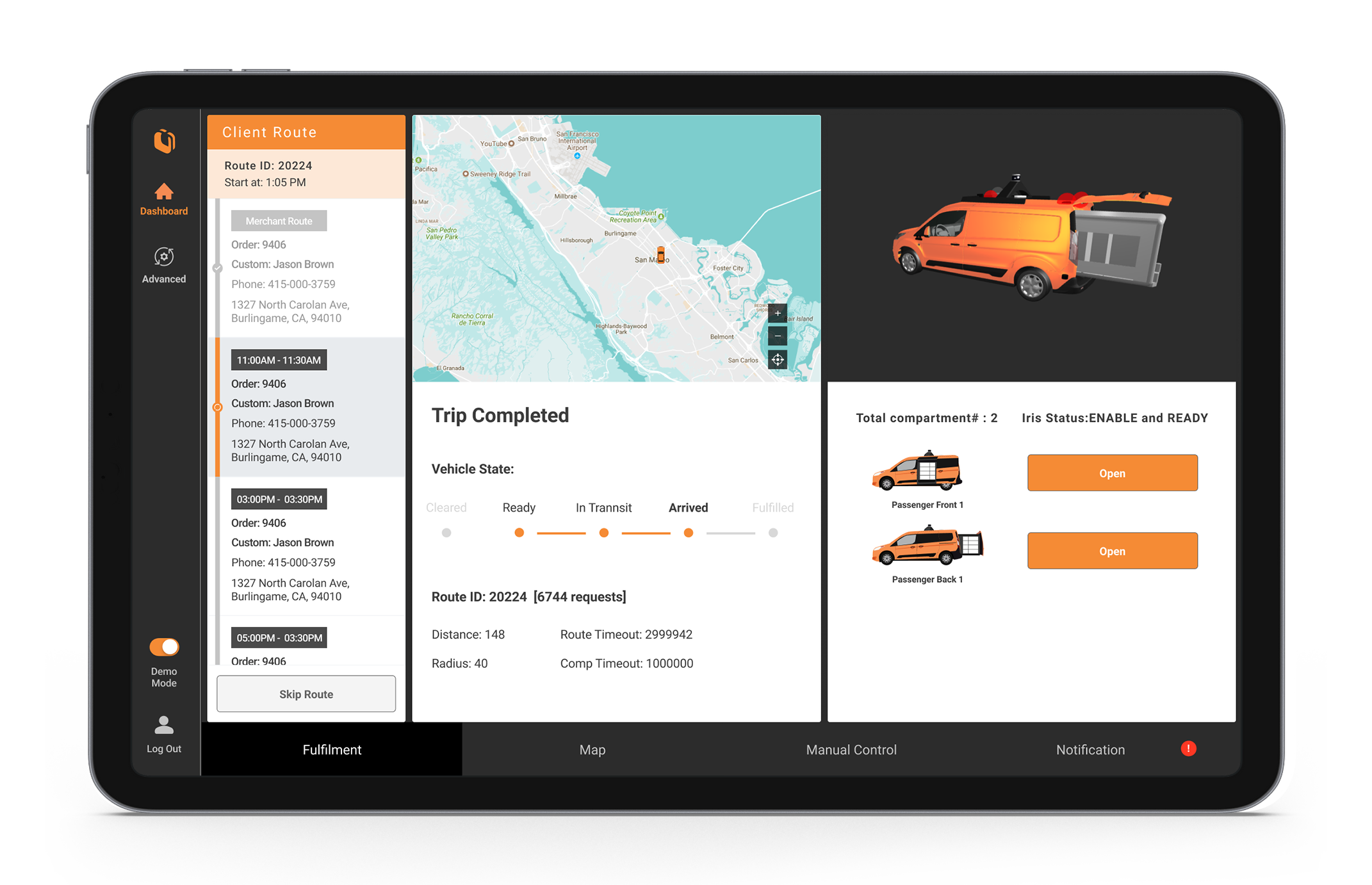
- Aware of open/close status and can manually open in case of errors
- Check cloud log.
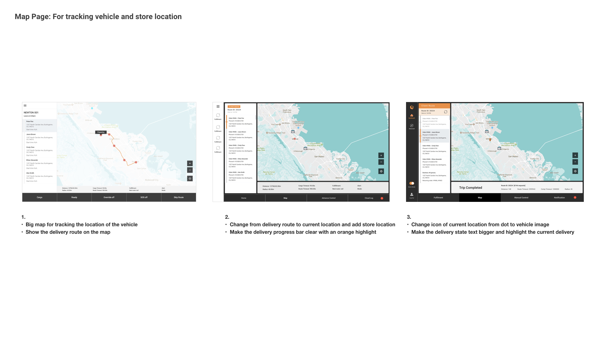
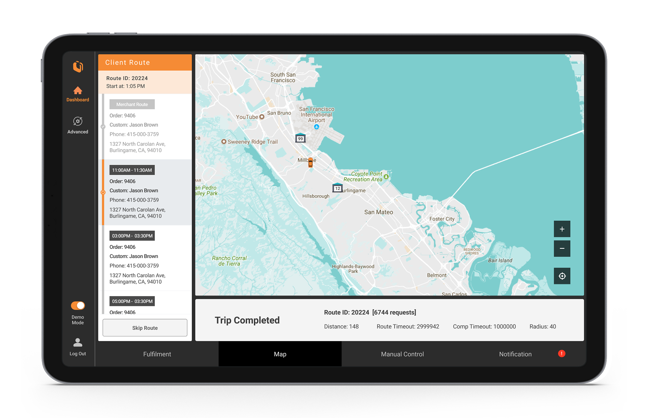
- Big map for tracking the location of the vehicle.
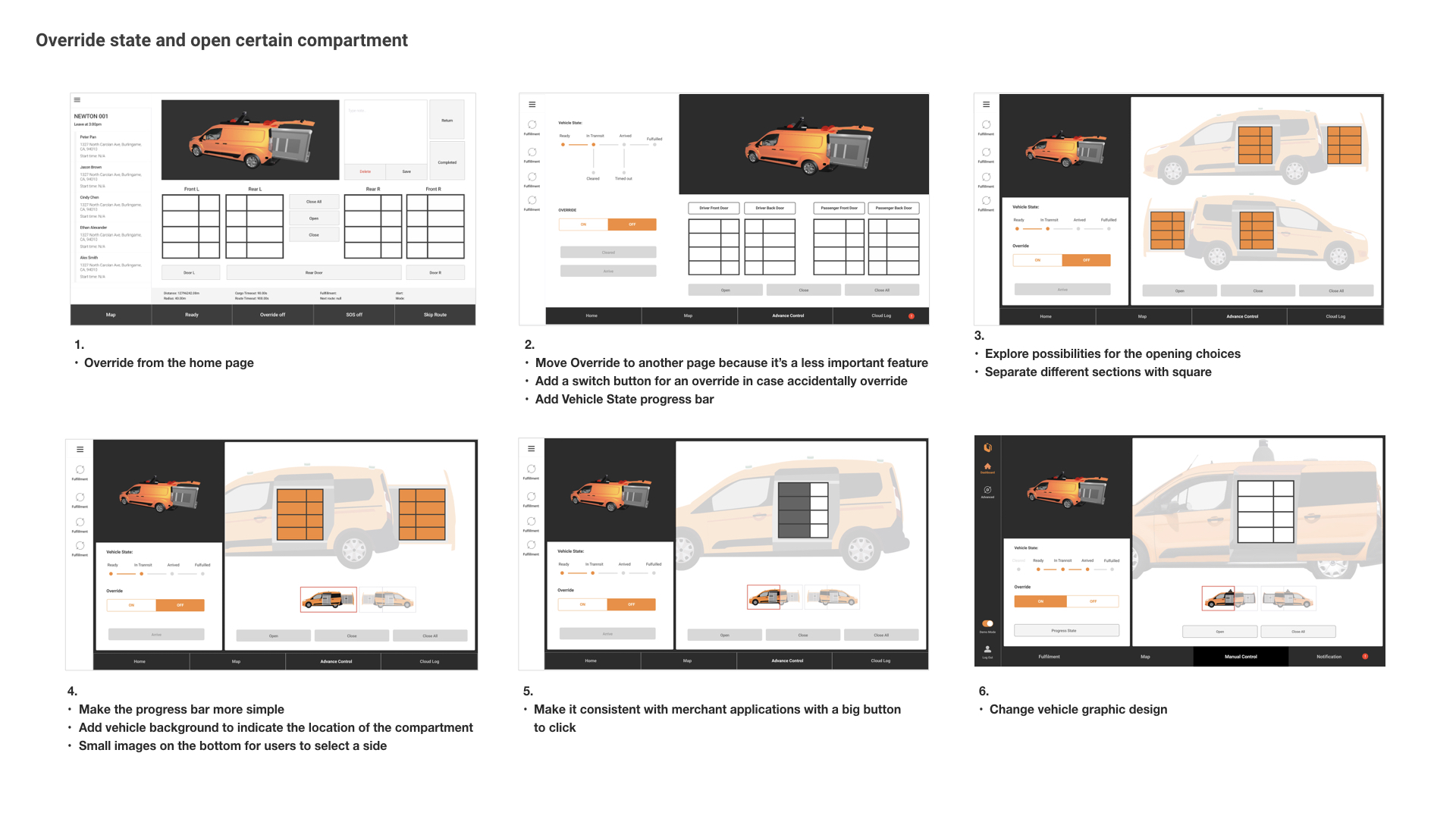
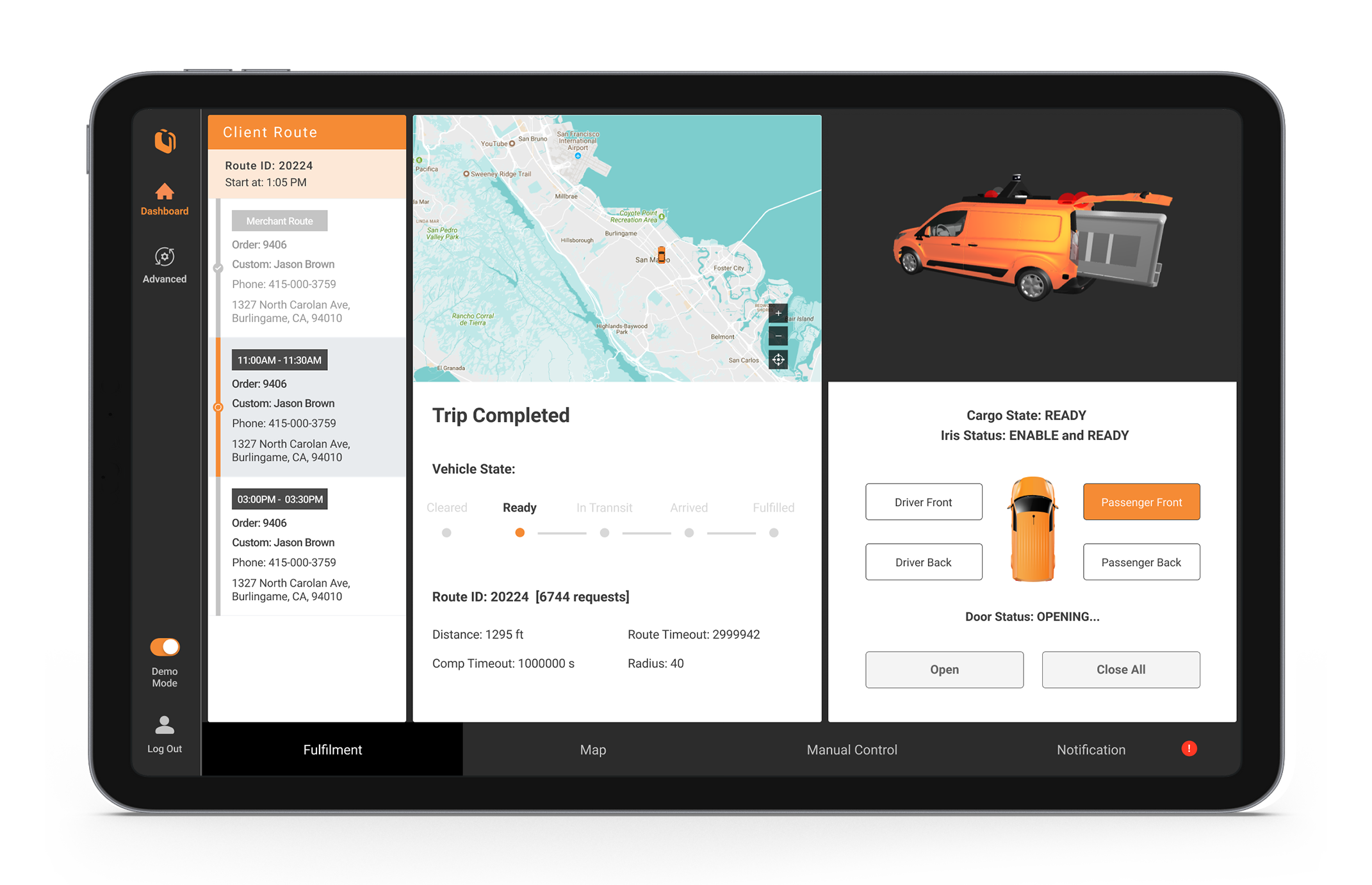
- Have the option to override the state and open a specific compartment.
- The choice to manually control and open the compartment of the vehicle specifically.
EXISTING DESIGN/EXPERIENCE PROBLEMS.
- The text and buttons are hard to read.
- Lack of visual element hierarchy.
- Hard to navigate the features.
- Not aesthetic.
- No clear instruction and task flow.
- Not mobile friendly, desktop only.
Inspiration Analysis
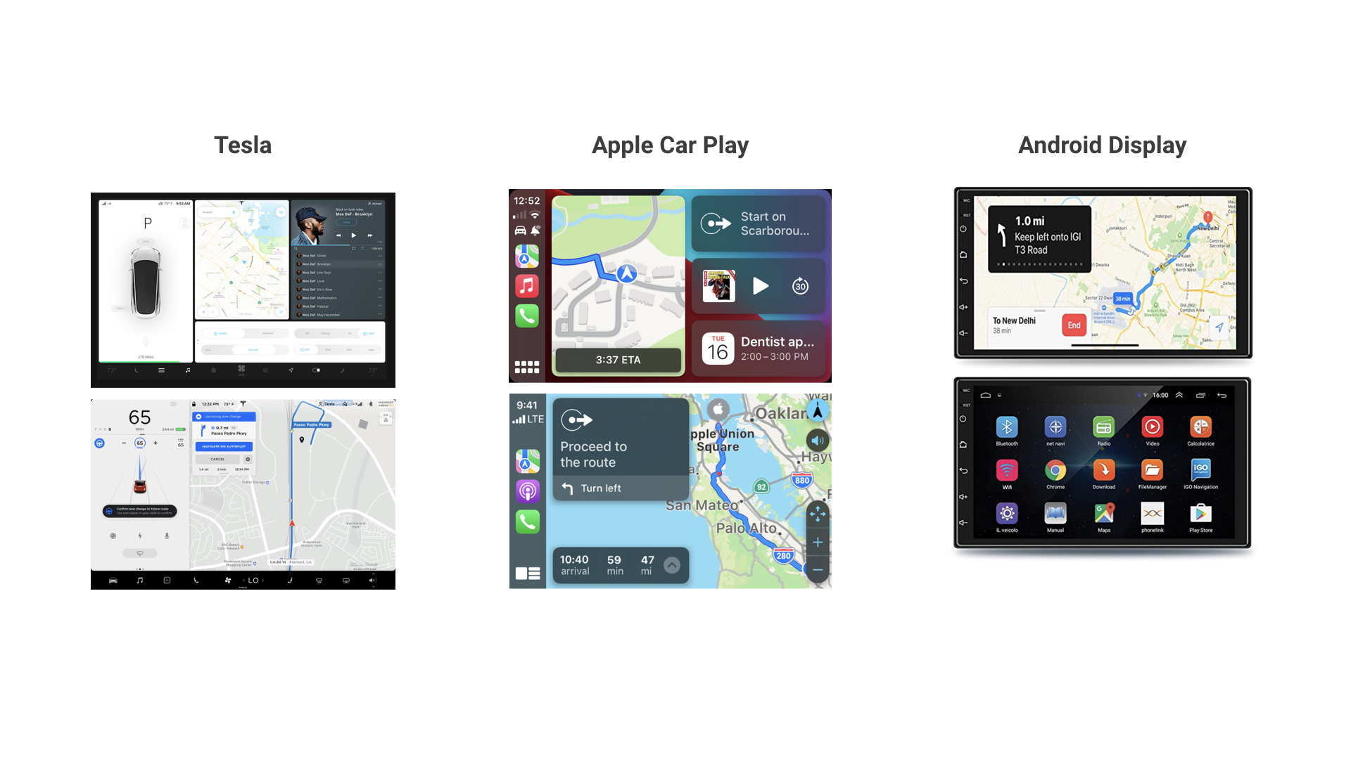
Learnings From Inspiration
- Most of the navigation bar UI is on the left or bottom.
- The button and text should be bigger enough for the user to click.
- Square UI design help separate different sections.
- Icons and images are more helpful for instant recognition than text.
- Highlight important information with color.
Brainstorming
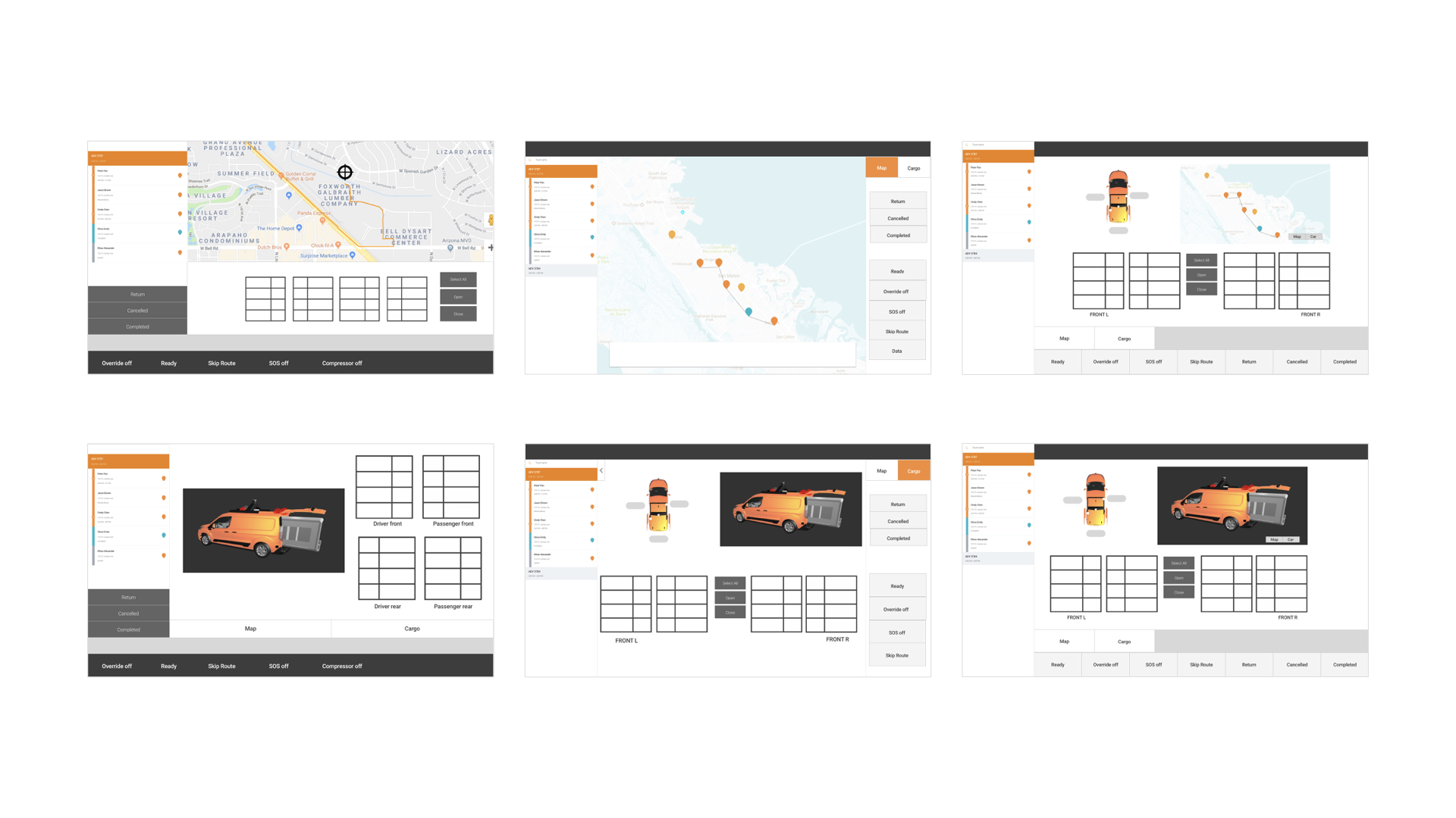
Iteration
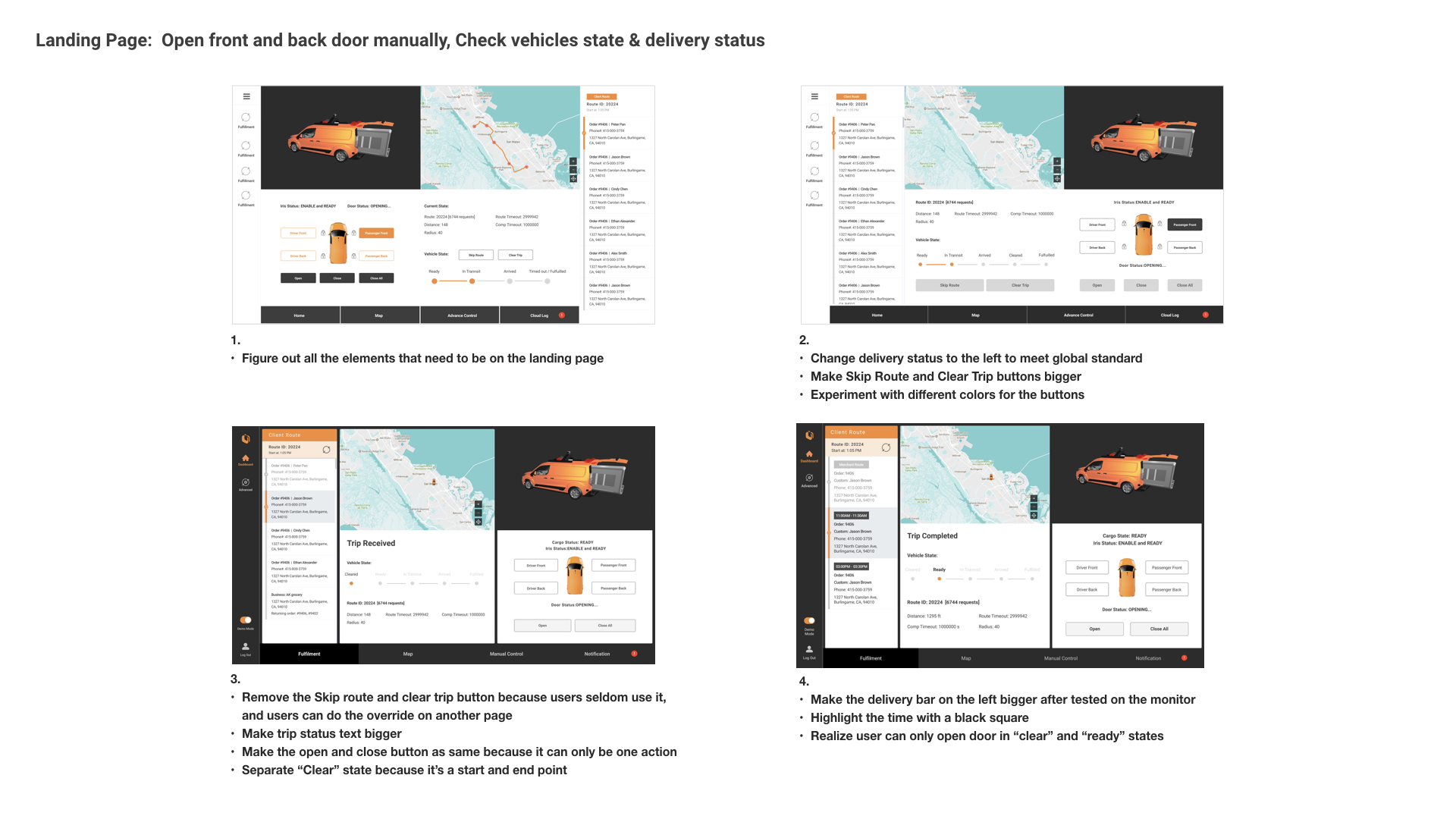
Final Design
Easy To Check All Delivery In Ready State
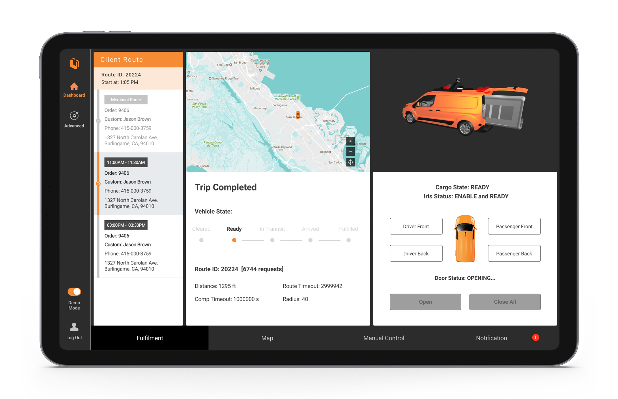
Indicate Location and Time When Driving In Transit State
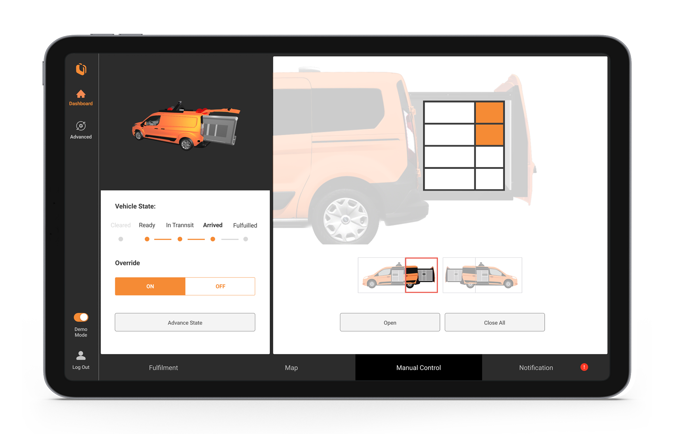
Manual Open Option To Prevent Auto Open Fail
Big Map View For Track Delivery Location
Re-Load delivery For Emergency Situation
Notification For Users To Debug Immediately
